Haven’t used the Sonos app that much in the past but recently started to (macOS on a MacBook Pro with two external monitors (one vertical and one ultra wide) and iOS on iPad Pro and iPhone 12 Pro Max).
First, would be great if the app would adhere to current system dark/light mode (as the major of other apps do today). I.e. just switch depending on time of day (when the rest of the system switches to or from dark mode)
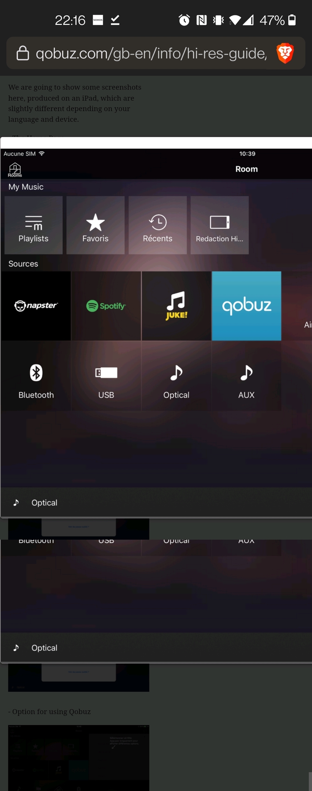
Second, maybe Sonos should put som UI/UX people on the overall interface? Everything is in like 8-10pt font size… really? Looks like something from 2008. Just in general the UI needs an overhaul to be on par with todays design standards. Why do I have to have three columns in the desktop version? How about two columns, one, 1/3, with current and available speakers, in queue etc. Column two, 2/3, with entire list and maybe large album covers on top and big accessible controls. What’s with all this “tiny tiny”… Of course this is the DTP version, where there is a lot of unused real estate… medium size and below is something different entirely. But just overall, the app really doesn’t feel up to date and really thought thru.
The only reason I’m using the sonos app (rather than casting from Apple Music or Spotify) is because the Sonos is the only place where I can have multiple services and have the music keep playing even if I leave the house.


 for that often-requested user-interface.


