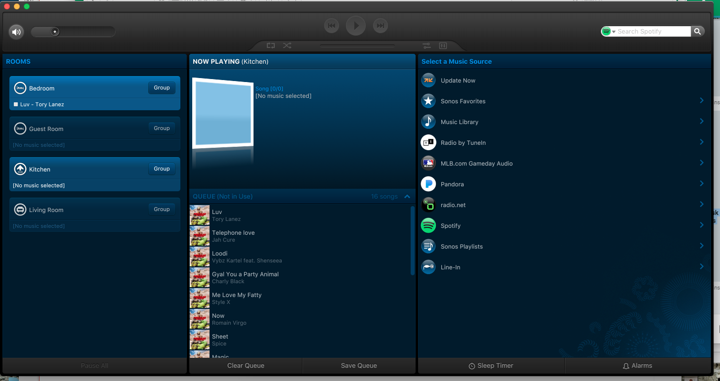
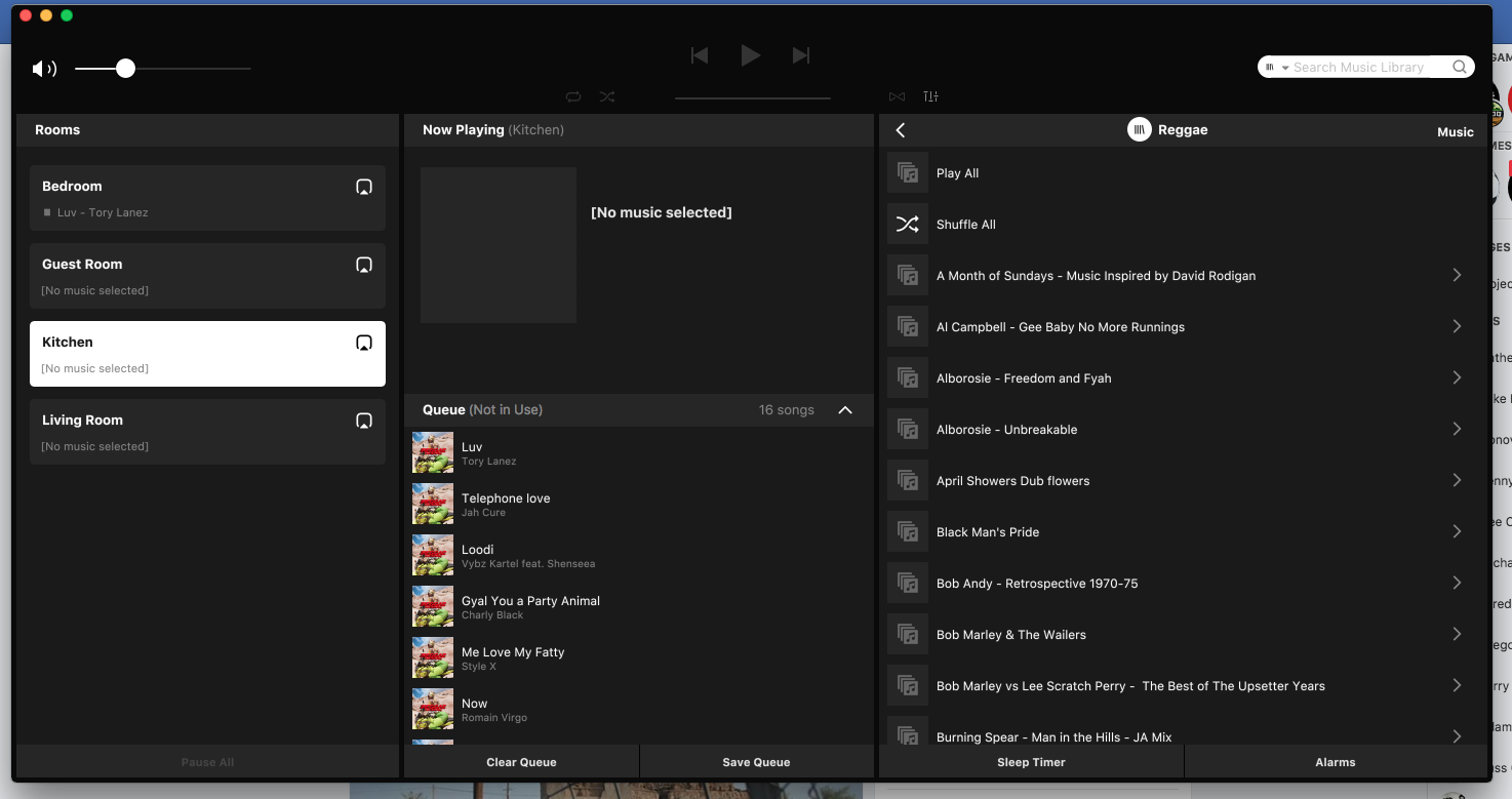
The Sonos Controller for Mac looks like it was designed in the 1990s, the interface of the iPhone/iPad app is so much better to use and nicer to look at. Why has this not been updated?? When with the Mac Controller be updated? it can't be that big of a job to reskin it . . . ?
Is this just a matter of form over function, or do you actually have a request for the controller to behave differently?
mostly the way it looks to be honest but browsing your library (larger images to scroll through) would be nicer as I have 2236 albums in my library, 21000+ songs and the small icon is frustrating. but I'd settle for a reskin.
The windows one is the same, just been a bit neglected I suppose in favour of handheld devices and voice.
then they should open it up to developers so people who do care and work on it!
still no update, Sonos this is so lazy and actually unacceptable. it is such an easy fix and enough people want it, you are underestimating your users....


Lazy! This year has seen more Sonos development than ever. Alexa voice control, Audible, new Products and iOS and Android updates a plenty.


Whilst i can understand a degree of frustration, the Windows and Mac controllers are probably now the least used of the controller types. Who are "enough people"? This thread has hardly been a busy one! They both work, work well, and with time are now looking Retro cool ;)


I don't think insulting the developers will help matters? And I struggle to find what is unacceptable, there have been no promises, there is no major functionality being missed out, which seems perfectly acceptable .
Search the forum, there are enough .... develop form and function as one .... otherwise it will always remain old and tired looking. Should be easy to align with iPad / iPhone apps seems lazy it’s not being looked at
I received a lot of heat over this post but THANK YOU THANK YOU THANK YOU .... this has finally been updated and its 100000000000000 times more visually appealing !
This all black interface they just rolled out is horrible.


I can not imagine wanting this over the old controller.


Black, and dark grey and white.


It's funereal and hard to read, the icons are smaller, and harder to see as well.


And most obnoxiously there is no way to toggle it back to the way it used to be, which for the record was just fine.
Are you kidding me? This update has made it 100% UNUSABLE on the mac. I restored from back up and will continue to use the older app (which is far from perfect, but 10^1000 better than the horrible color scheme we just got.


Do you know what the last version of the App for OS X was? Can you post the version number? I am going to try to find an installer download of that so I can roll this back.
It says v. 9.1 I don't know if that's the last one before this newest one. I hadn't updated in a while, so there could have been something more since this.


In what possible world is this black rubbish better than the blue themed app?
9.1 was the updated version as of yesterday. I remembered I had a TM backup running, and snagged it.


It is available here for download: https://www.macupdate.com/app/mac/31941/sonos/download