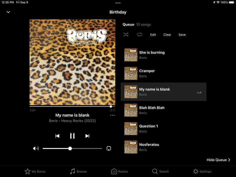
I just updates from S1 to S2. Glad that I can turn off some ancient protocols on my NAS. But one thing seems weird to me. The S2 app itself seems super ugly. Maybe it’s only supposed to run on a phone? (I’m on an iPad).
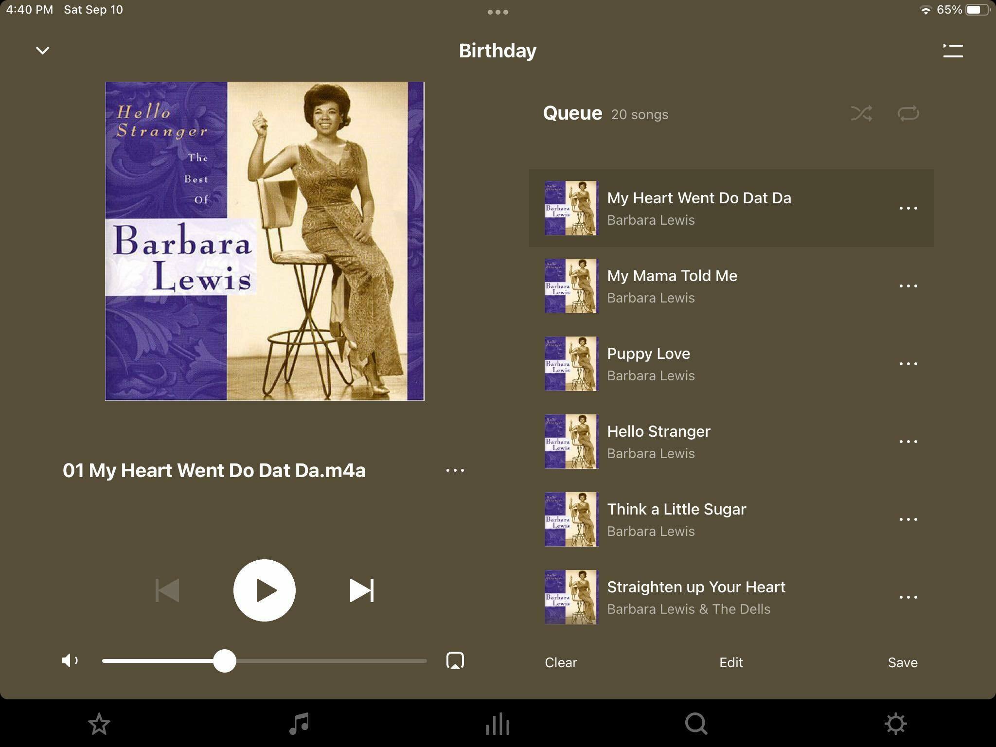
It’s strange to me that the player is this brownish color (see uploaded screen). And the player part doesn’t change with light mode and dark mode. It’s always this brown. Also, the library access pages seem kind of ugly. In the default skin they are like gray on gray.
What’s up? Am I doing something wrong?
Page 1 / 1
For comparison, the S1 player had a nice black background. Looked better, text easier to read.
You probably still will not approve, but I’m sure that you have discovered that the S2 background color reacts to the current artwork.
I guess it’s each to their own. I run both S1 and S2 systems here and I prefer the S2 App. It has a warmer appearance/feel compared to the older S1 App and some of the music services have a much nicer layout and display.
@buzz actually I had not notice this yet. Yeah, I don’t “approve”. having the player background “the same color” as the album artwork is an incredibly bad choice - I don’t think any designer I know would put two colors that are similar but not the same as the two main colors. And the lack of visual contrast can be pretty bad.
If the album cover is almost a solid color it becomes nearly invisible against the background.
I’m not the best designer in the world (that’s an understatement), but for using background colors I’m familiar with of course white or black (two very popular choices), and also “contrasting” colors that are either 180 degrees or 120 degrees apart on a color wheel. The same color for foreground and background? - I don’t think I’ve every seen that design technique used. And then making the text a lightened version of the background - ugh!
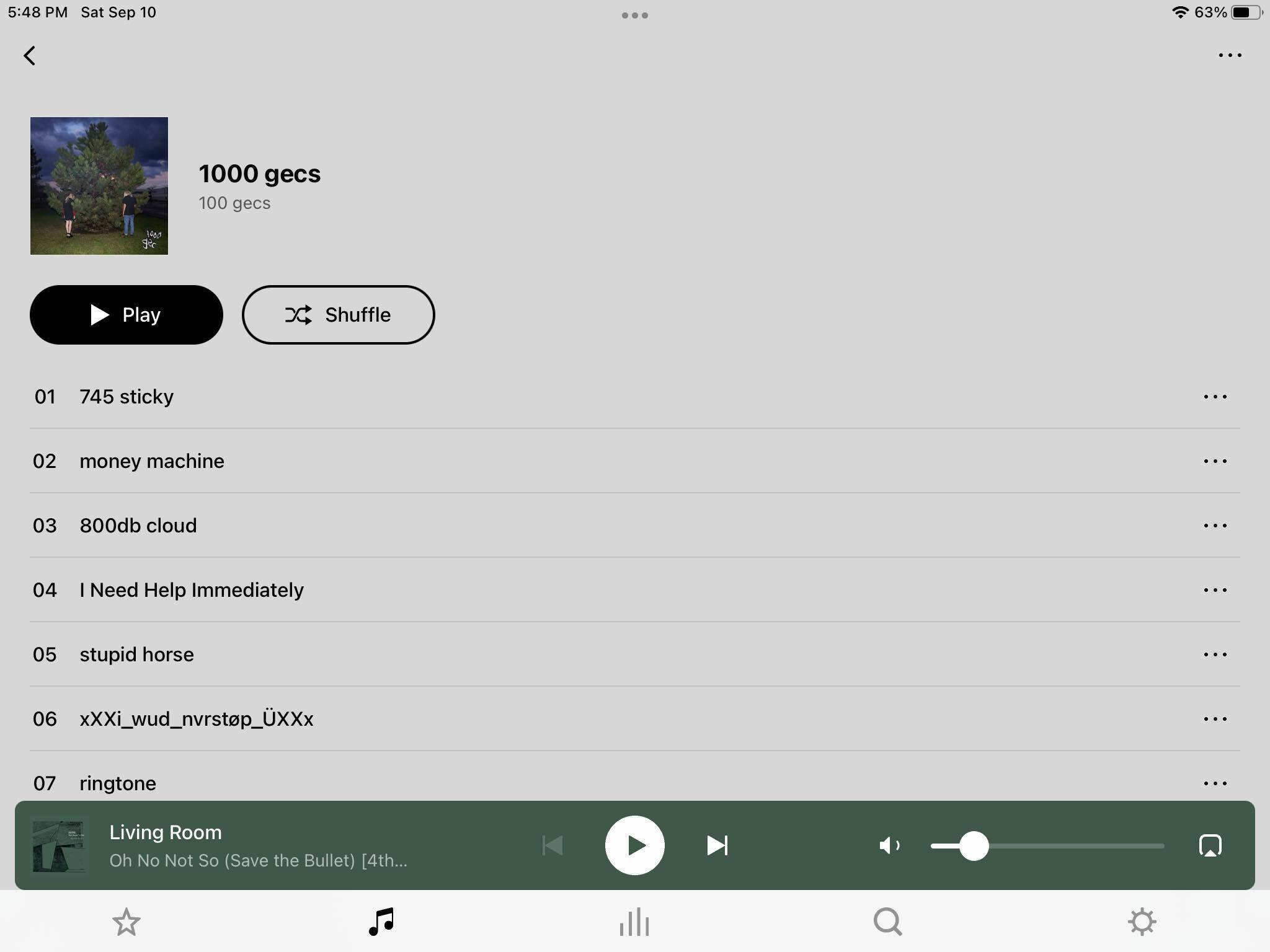
Also - the system default for the library… dark text on a medium grey background with some white text in other places? And seeing the color of the song playing down at the bottom while you look at the album cover above?
Why on earth would anyone want black text on a dark background?
I know this is all personal taste, but wow, the designer if this app has very unusual taste.
Honestly, when I saw this library screen, below, I re-booted my ipad - I though something had glitched out.