Hey folks, ex-Sonos engineer here! I love what you've been doing to improve the UX after changing the router password or the router itself. Great work! I don't need to carry an Ethernet cable when I travel with Sonos anymore.
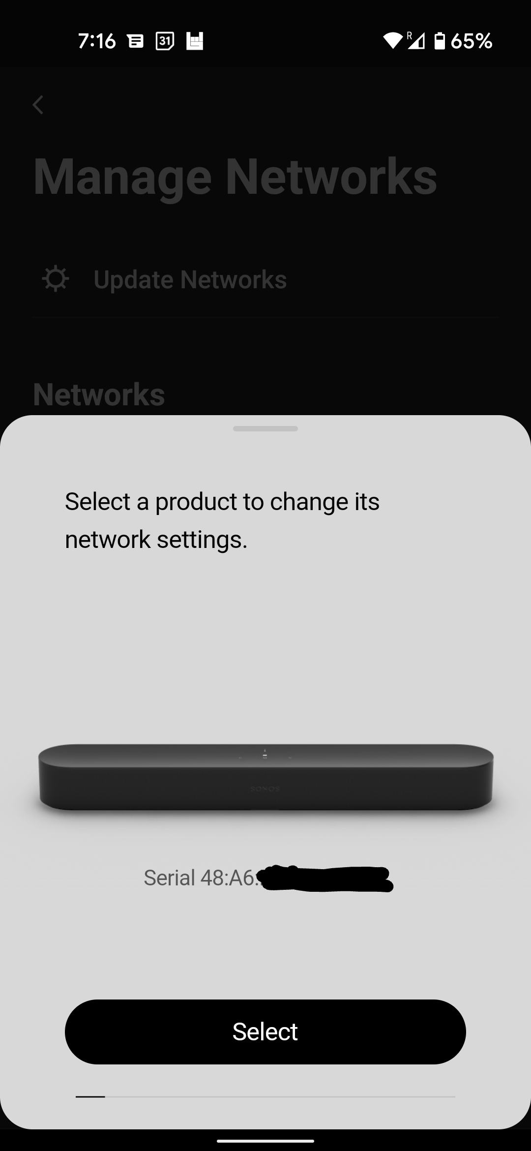
My feedback: I have many Soni, and usually travel with one or two. When I get to my destination, I go to Manage Networks. In the "Select a product to change its network settings." screen, it took me quite a while to figure out why it was asking about my Beam (see pic) which was at home, rather than either device I had with me.
I was super-frustrated for an embarrassing amount of time, until I realized it was a carousel of all my devices, and I could swipe to the one I wanted.
The thin grey line with an black indicator at the bottom isn't enough of an affordance. Please make it more obvious that there's stuff to the right!
Thanks,
Seth


