Hey all, I got a request to make:
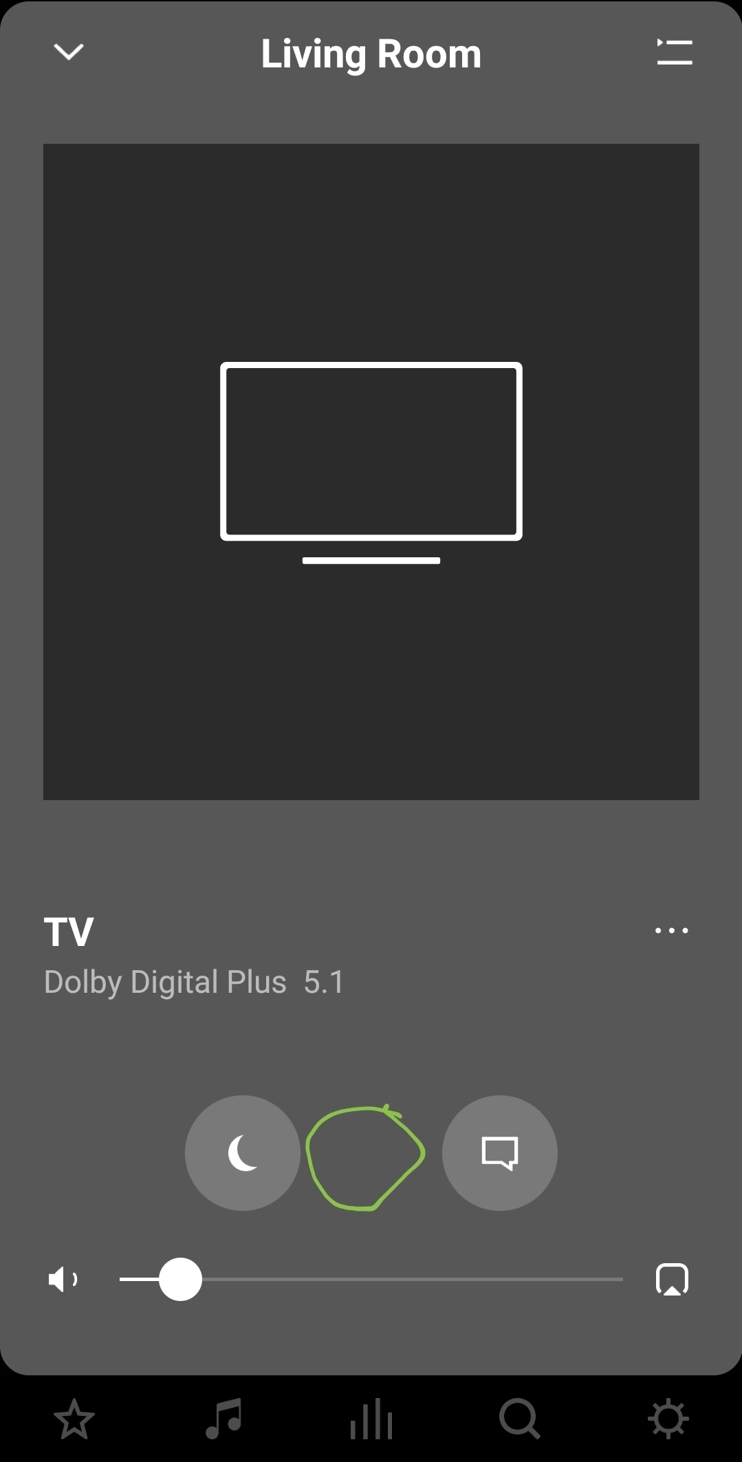
Wouldn't TV dialog sync would be much more reasonably placed if it was in the main UI as seen in the screenshot below?

Either here or at least under the 3-dot (setting) section.
Why is it much more reasonable? In one word: usability.
In a couple: Think of the feature's use-case.
I, for instance, have several products which I use: Xbox, Native TV apps and a streamer. Some apps require me to use the TV dialog sync, which requires searching for the settings and clicking through a minimum of 4 menus, with some scrolling thats involved. That's not very convenient when you're already bothered by the off sync and care to enjoy the content you're watching asap.
Also, adding it to the Widget so it will be only one click away might also be awesome.
Hope this can be considered and prioritized.
If you read this, please respond and add your feedback or just reply with "+1". Perhaps we, as a community, could help to make the change by showing the value this would add to the community.
Thanks.


