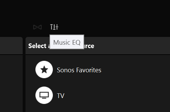
5 clicks to get to the EQ once the app is open is too many.
More - Settings - Room Settings - Living Room - EQ is just too many taps. Getting back is OK – just two taps.
Perhaps I should get out more.
You can in the app Sonosequencr create profiles for the equalizer that you can go in and one-click button launch. You could create like Rock Profile, Vocal Profile, etc. and then just click on the button to adjust the speaker.
Sometimes all I need to do is toggle the loudness setting, this shouldn't take 6 taps.
Disappointed on day one to find it takes too many taps to get to the EQ. Not sure what Sonos app designers were thinking, that people wouldn't use EQ very often?
Different sources of music, and different types of audio will require regular EQ adjustment. It's a shame the app can't allow us to make a "shortcut" or "favorite" link to the EQ which is needlessly buried in the settings.
Why not bury the volume control in the settings too, the pattern of inconvenience would then be complete.
Tip: Once you've drilled down to the EQ in the Settings menu, the Settings tab at the bottom is the shortcut. Like other tabs it remembers your place in the hierarchy.
...the Settings tab at the bottom is the shortcut... Like other tabs it remembers your place in the hierarchy.
It's literally not the shortcut!
It remembers your place in settings, which might not be the EQ page, and it only remembers per session. Close the app, and the settings page no longer remembers where it was, even when the music is still playing between sessions or app closures.
Can you imagine in design meetings they said "let's make a trick part time shortcut to the EQ, call it "settings" and is not guaranteed to always show you EQ."
As soon as you want something else in the settings area, it then feels like catching a bus again, back to EQ. If you don't go back to EQ, you will facepalm again next time you press "settings" to get to EQ.
I think what's funny is when I first opened this app for the first time. I couldn't find the EQ. 🙂 First time in my life I couldn't find EQ on an audio device or app that has EQ. I had to Google "where is EQ on Sonos app" and that made me laugh. It didn't help that labels and buttons look the same in settings, and I always tap headings because there is no visual difference between a button and label. Feels like the UI design never progressed from wireframes! Love the speaker though!
I’ve just realised that on an iPad at least, one-step toggling IS available if you don’t need to browse all the time. Forgive me for not knowing the correct names for each page. Set your playlist or whatever you’re doing and start playing, from the black page (I told you I didn’t know the correct names). Then tap Settings and navigate to the EQ page. That will take a few taps but you can get straight back to the black play page with one tap on the black area where the volume control is shown at the bottom of the screen. You can then get back to the EQ page again simply by tapping the downward arrow at the top left of the screen. One-step toggling.
Of course, if you want to start browsing again that will rather mess things up. And having posted this I see others have got there before me. C’est la vie.
An alternative is to use your iPad for playing and browsing and your iPhone for EQ. That’s what I’ve been doing for the last couple of years.
I don’t get to say this terribly often, but: PC controller ftw. There’s an EQ button right on the main page.

Enter your E-mail address. We'll send you an e-mail with instructions to reset your password.
