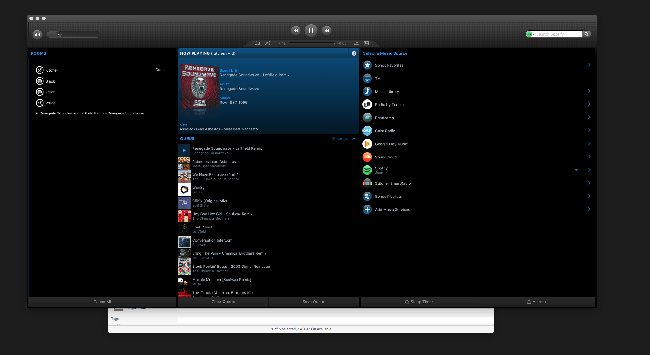
It would be nice to be able to select different skins for the controller on the desktop. The current skin is dark and small text. It's hard to see the subtext that appears to be a light blue on a dark background.
I agree. The UI is dull and dark. I've been using Roon, which is far superior except it has so many issues with Sonos devices that I have had to give up using it. A re-vamp of the Sonos UI and some skin options would be really great.
After spending time on the forum....spent about 15 mins messing with the package of the Sonos app on Mac and ended up with this - without opening Photoshop....if I with very little expertise can manage this....why can't Sonos????


I'm gonna mess with it again when I have more time and going to try and emulate the Spotify colouring!


Sonos have development priorities, and for controllers that seems to be voice > music services > mobile app > desktop. Yes, a design refresh that fits with Sonos branding, mobile controllers and modern operating systems would be welcome (and with the standard light/dark themes). But even something as seemingly simple as creating, testing and shipping a new theme - with all the required design assets that works for multiple screen sizes / OS platforms - takes time. Sonos know how many customers (especially the new customers) use their various mobile / desktop apps, and therefore what to focus their efforts on.