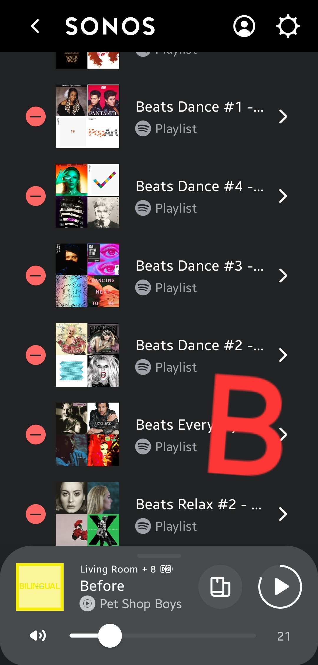
I'm wondering if it is in the cards with any of your future updates to change the way the playlist looks. Or give customers the option to view either way.
The current view of playlist under Sonos Favorites. See picture A. Is not user friendly and is difficult to scroll through the large font and pictures. Especially those with many playlists.
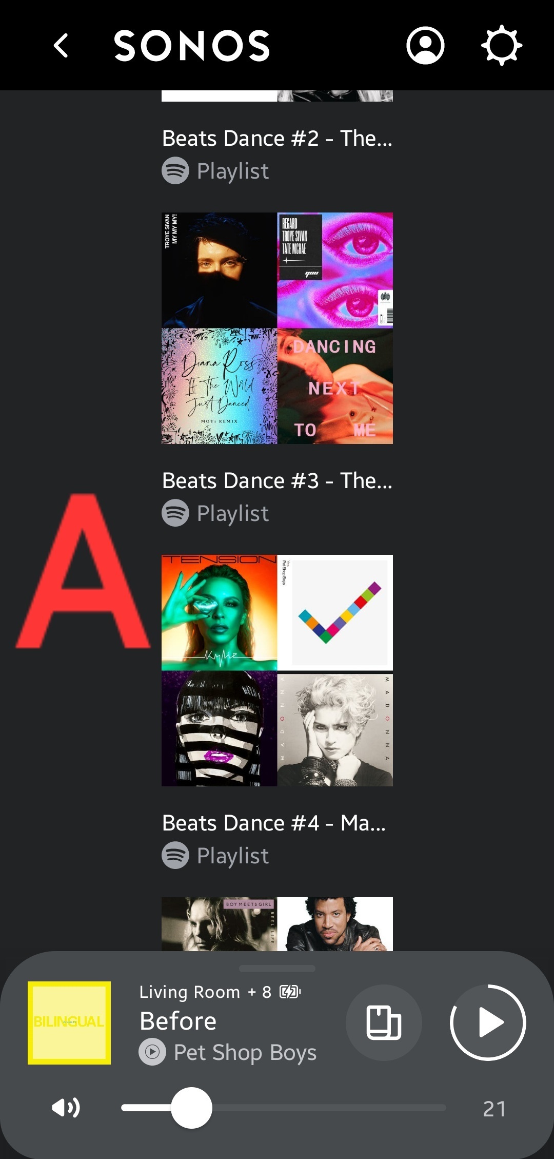
It should be more like a summary line view Like when you see when you click edit playlists. See picture A.
It was better before you guys did the new update on the app so I'm hoping you guys will bring back the older view, it's easier to navigate through.
Thank you hopefully we'll see this soon