I’ve been using Sonos for 16 years (one of their first users.) I’ve purchased close to 50 Sonos devices.
I’ve been complaining about the UI for 15 years. It’s horrible. Performing simple actions like opening the equalizer requires 5 minutes of discovery every time you want to use it.
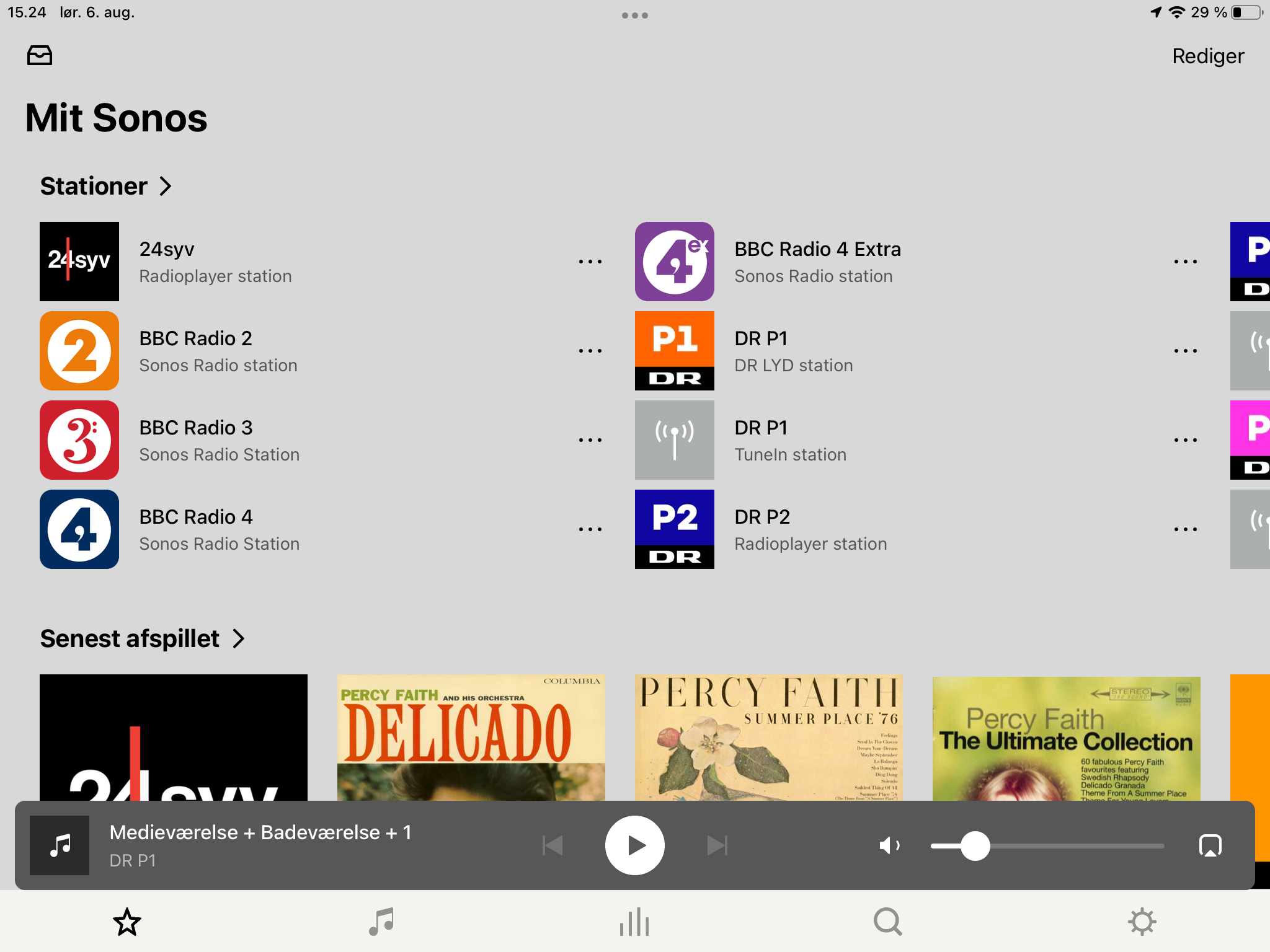
Why don’t the navigation icons at the bottom of the app have labels.
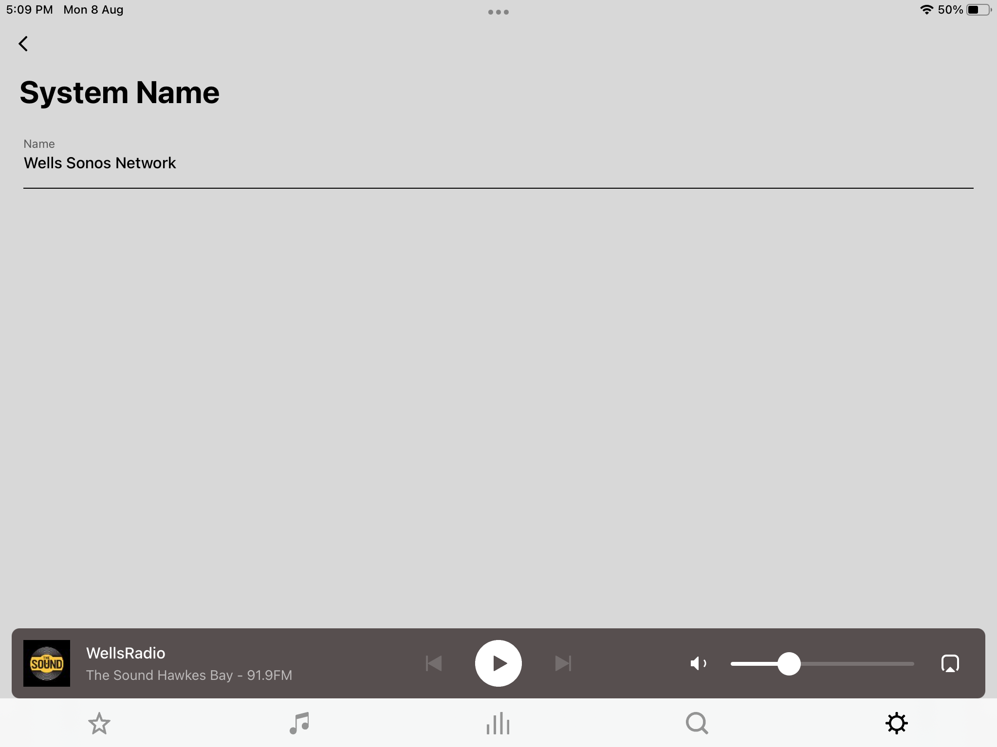
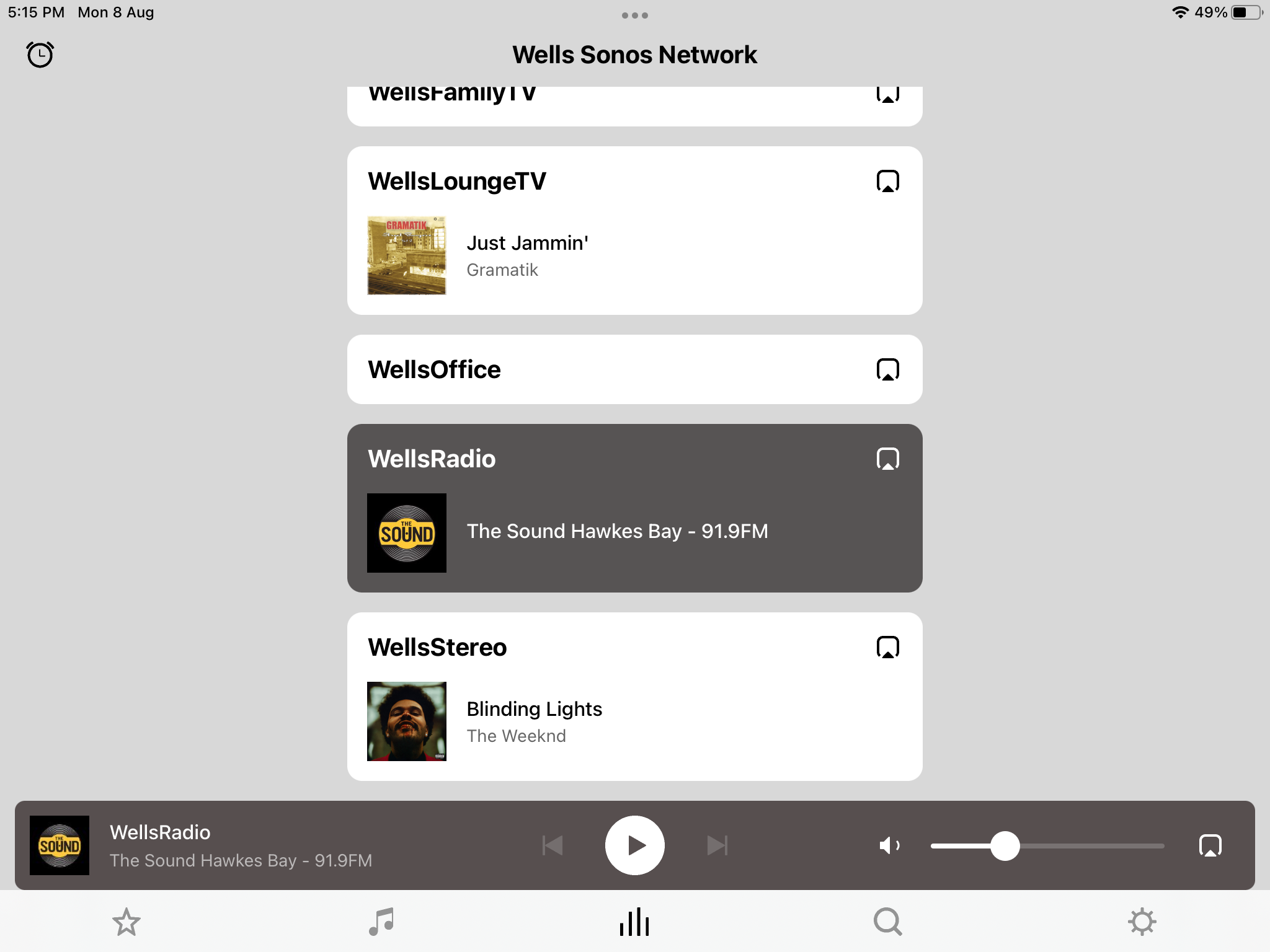
Why does the screen for selecting rooms/devices have the title “System”. Why is the icon in the navigation bar for this function totally unrelated to the function. Why is the setting for Alarms on the screen for selecting rooms.
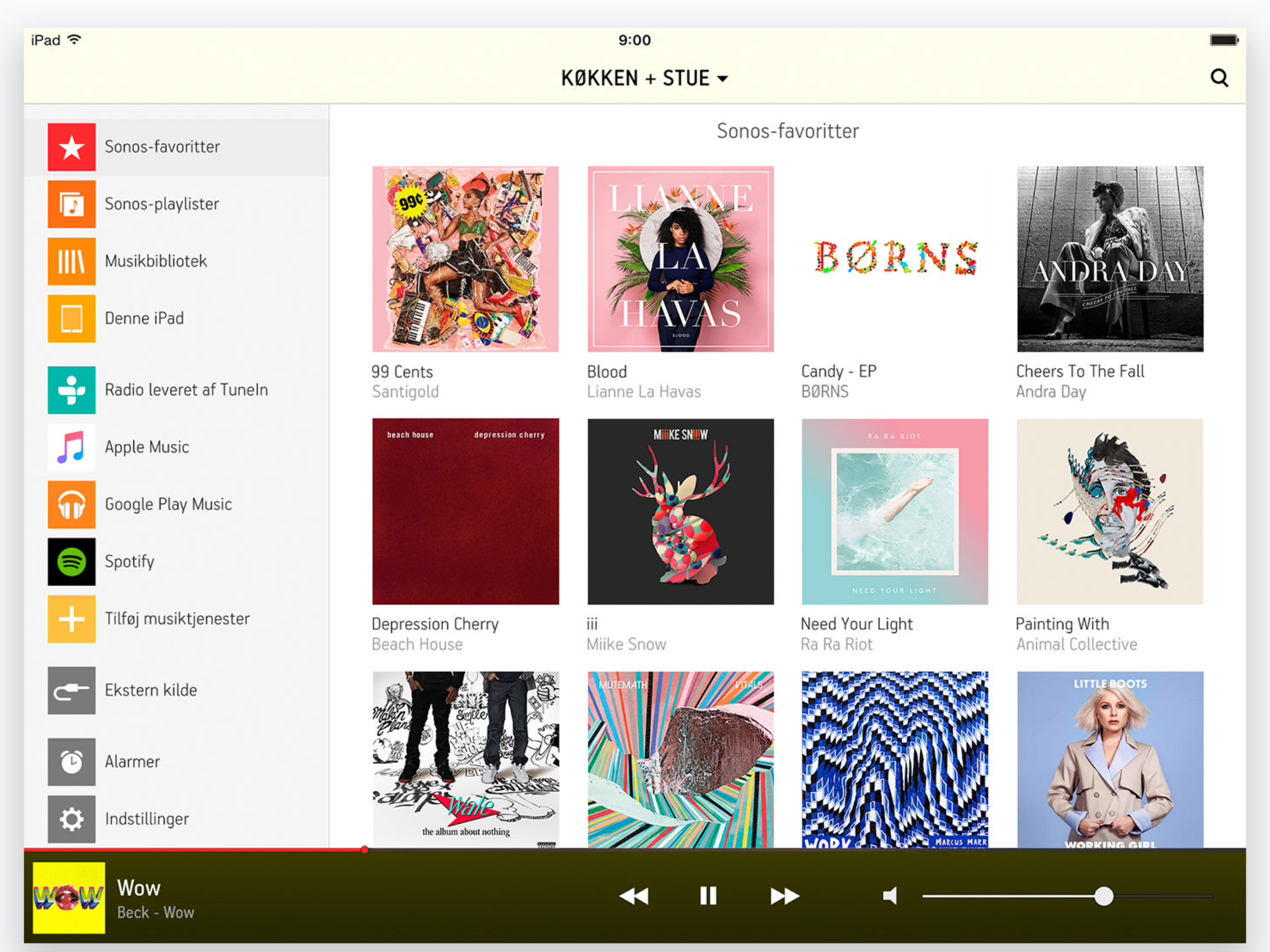
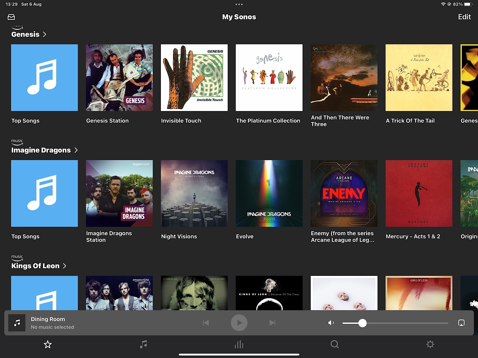
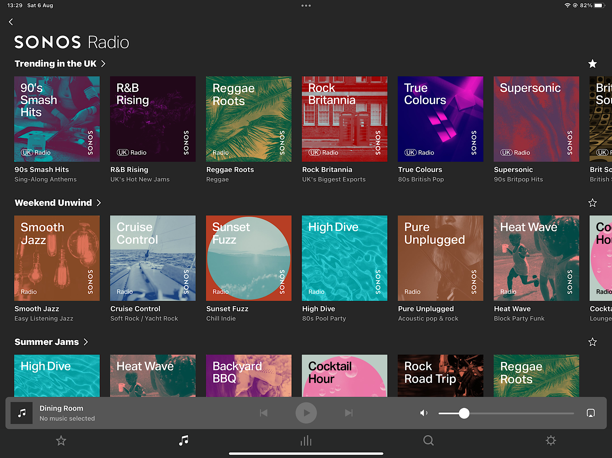
Why are there three separate icons (search, favorites and browse) in the NavBar for selecting Music.
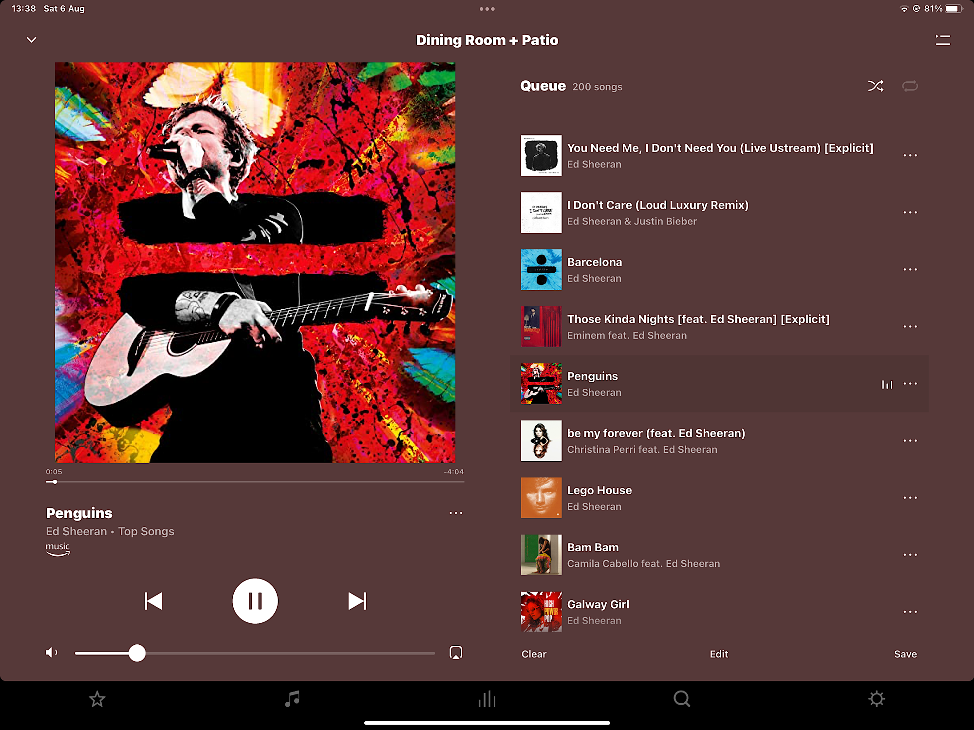
Why are the playback controls hidden in the collapsed now playing screen.
Setting up a new AMP…...What kind of imbecile would require a user to input a code into the app when installing a new device that’s written in illegible characters (requires a magnifying glass) on the back of the device, and only let the user know that it’s needed after the unit has already been installed at the back of a rack, under a sofa, or on the bottom shelf of a bookshelf.
“How do you want to use Amp” - It’s not “as stereo speakers” ….. it’s “with stereo speakers.” AMP is an amp. It’s not a speaker (or speakers.)
In addition, to being a Sonos user, I work as a product manager. It makes me want to puke every time I use the Sonos app.
This has to be the worst UI I’ve ever seen on an app for a well established Comapany