The new app is terrible.   I think my experience is worse because the app update happened during our move into a new house, new network, new ISP, etc.   I have  deleted my Sonos app, Sonos account, reinstalled the app, set up a new account, factory reset all devices a dozen times, tried 2.4 GHz, IoT onboarding, etc, etc, etc.  I can see the devices all connected to my Wifi, but none appears in the Sonos S2 app on my system.   I was able to get the ARC to finally appear on a wired ethernet connection, but disappears when I unplug and go wireless.   I might be able to run a switch at my TV to connect TV, ARC and Sub wired, but Sonos should fix their issues.

I think the best thing I can do right now is file a warranty claim on my Platinum AMEX since Sonos will not respond to Support emails.   I don’t have hours to spend on the phone on hold since apparently their help desk is overwhelmed with customer issues.   I have already wasted hours trying to set up the Sonos.  I installed at least a half dozen other devices (two garage door openers, two wireless garage door opener keypads, power shades, etc) on our new network easily in a few minutes, so it is not me or my networks that are the issue.    Sonos is the problem.

I experience the sluggishness that so many people did, and improved my setup by wiring my ethernet cable into a Connect Amp. My music lag time (for playing / pausing) has gone from minutes (or never) to about 1.8 seconds. Actually, pausing is now usually near-instant (maybe a 100 or 200 ms lag.. still too slow IMHO), but playing takes up to 1.8, sometimes 2 seconds. That is still frustratingly long.. but is closer to being acceptable.


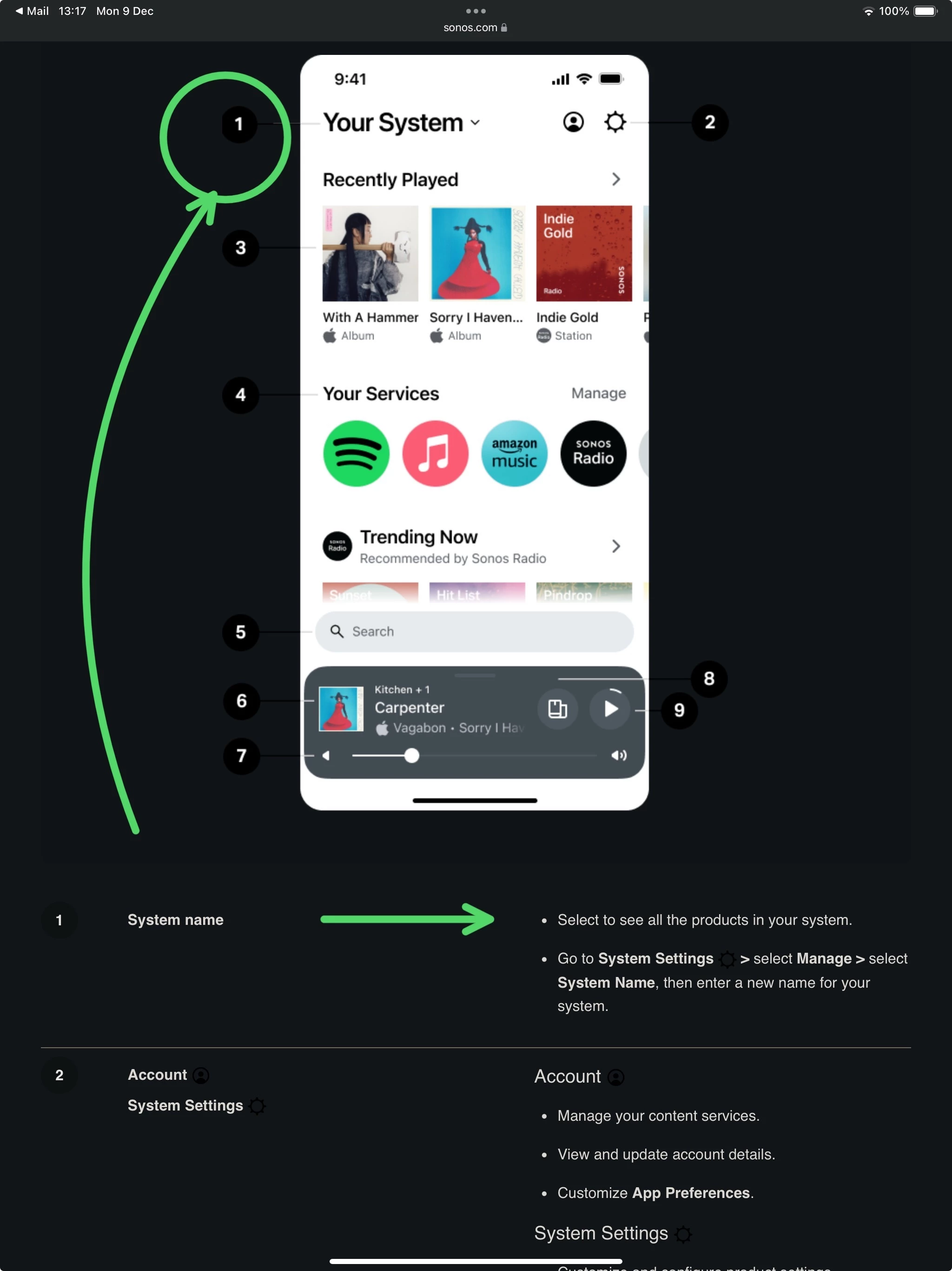
My main issue with the UI is when I want to search for a new song to play, it takes multiple actions to get to the search box;

  • I can tap Sonos logo at the top to go to the Your System screen, where the search box is below Recently Played and Your Services, and near invisible. That’s two actions.
  • Or, if I have on room open in the app, I can swipe that down to get to the Your System screen, then click the search box. 

Why, oh why, isn’t the search box simply where the Sonos logo is? That Sonos logo takes up valuable screen real estate, and having search there would make all kinds of sense. 

The top left < nav icon is confusing, and I think it would be better to replace that with a Home icon, linked to Your System. Users don’t need to see a Sonos logo in the app UI to remind them they’re using the Sonos app. I just find these to be bizarre UI / UX decisions.

I don’t see too much sluggishness in the new Sonos App, except perhaps when playing from some streaming services, but the search feature at the foot of the Home Screen is really quick, all things considered.

I don’t mind the fact that Sonos have chosen to locate the search feature at the foot of the Home Screen and it’s nice that you can filter the search by each one of MSP installed in the App, by selecting a service first and then performing a search and/or then go onto tab across the top of the search screen to search within each service separately. See attached screen-captures, as examples, recorded a few moments ago.


Why, oh why, isn’t the search box simply where the Sonos logo is? That Sonos logo takes up valuable screen real estate, and having search there would make all kinds of sense. 

The top left < nav icon is confusing, and I think it would be better to replace that with a Home icon, linked to Your System. Users don’t need to see a Sonos logo in the app UI to remind them they’re using the Sonos app. I just find these to be bizarre UI / UX decisions.

Thankfully Sonos appear to acknowledge the UI still requires work as “UI fit and finish” appears on their Trello board. Nick Millington himself also stated “There are certain compromises that are not ideal in my personal opinion” so one can hope there will be improvements made to UI/UX in coming updates as the current UX is still well below par in comparison to S2.


I wonder if Mr. Millington has ‘impersonal opinions’ as well?

:)


If I recall the comment Nick Millington made on the Reddit Q&A, it related to the actions performed on the mini-player/slide-up ‘room-selector’ screen.

In the background area of the minimised player at the top of the ‘room-selector’, in the Sonos App, the user ‘taps’ to show the ‘now playing’ screen, or slides ‘up’ to reveal the ‘room-selector’, or touches the volume slider to increase/decrease volume (by 1%) or ‘taps/slides right’ to show group volume screen (in the case where rooms are grouped/displayed in the mini player), or presses and holds the volume button to increase/decrease volume on a room/group… he was concerned that those things were perhaps confusing for the end user and there might be a need to improve the UI/UX at some later point.

It certainly was not a reference to the new Sonos App search feature, which was first introduced in the S2 App as an alternative to the Classic search. That said I guess Sonos will go onto listen to their users/testers and will make any changes they think will help to improve the UI/UX.


I forgot to mention there’s also the button on the ‘mini player’ screen that allows the user to jump directly to the room grouping/ungrouping screen aswell.🤷‍♂️


If I recall the comment Nick Millington made on the Reddit Q&A, it related to the actions performed on the mini-player/slide-up ‘room-selector’ screen.

In the background area of the minimised player at the top of the ‘room-selector’, in the Sonos App, the user ‘taps’ to show the ‘now playing’ screen, or slides ‘up’ to reveal the ‘room-selector’, or touches the volume slider to increase/decrease volume (by 1%) or ‘taps/slides right’ to show group volume screen (in the case where rooms are grouped/displayed in the mini player), or presses and holds the volume button to increase/decrease volume on a room/group… he was concerned that those things were perhaps confusing for the end user and there might be a need to improve the UI/UX at some later point.

It certainly was not a reference to the new Sonos App search feature, which was first introduced in the S2 App as an alternative to the Classic search. That said I guess Sonos will go onto listen to their users/testers and will make any changes they think will help to improve the UI/UX.


No, the quote was around UI in general, with an example given. It did also touch on search, so there may be further developments there too.

His actual quote from Reddit is as follows:

The obvious solution is to make all the main areas of the UI (music browse/search, Now Playing, Rooms/System View) accessible from all other areas.  This however takes up a lot of screen real estate with navigation buttons, or forces us into gestures like swipes that can be difficult for new users to discover

The current UI is our attempt, based on a considerable amount of user research, to make the most common navigation operations obvious, but still allow power users to get from each of the areas to the others in one operation.  There are certain compromises that are not ideal in my personal opinion, like the different behavior when tapping vs swiping up on the Now Playing strip at the bottom of the screen, which breaks the physical metaphor of a stack of cards you are shuffling through (as you point out) and we will continue to work hard on optimizing the design.

As the Reddit poster stated, the UI in its current form is a hot mess, which I have to agree with.


Yeah I read it differently and see it more about the reason why Sonos stepped away from a tabbed interface to make main areas of the App more accessible from everywhere, mostly in just one step and the improvements to the search at that point were more a reference to the local library search.

I’m personally happy with any interface as long as it works and I am able to become quickly familiar with it - I find the new Sonos App does work for my needs and see it as being simple to use. I didn’t need to study a user manual to understand how to navigate around it - I think new users would find it much easier than the old S2 App.

In basic terms it really is a simple matter of slide up the ‘room selector’, choose a room/group and play an audio source from the Home Screen. It doesn’t really get much easier than that.

The quote mentioned the Search option, it had nothing to do with local library search not being available at that time.

The UI is much more than simply selecting music to play on a speaker.

As I mentioned above, thankfully Sonos acknowledge the UI Fit and Finish can be improved and have it listed as an ongoing app improvement. Unfortunately, 7mths on since the disastrous release there are still many aspects of the UI that need improvement.


I can’t really add anything further ​@Mr. T - I just find the new Sonos works for my system needs and find it extremely simple to use. I can’t truly say I’ve seen that many errors with the App.

It loads much faster than the previous S2 App and never fails to discover all my devices. All the music sources work (except where there’s been a known outage) and I don’t have issues with volume controls like some users mention.

I can’t recall the last audio interruption or dropout either across my rooms or groups. So I have very little to complain about here.


Even my old iPhone XR, which must be at least 4, or 5, years old (probably even older) and perhaps not as fast as more modern mobile devices, does a pretty good job as a Sonos controller with the new Sonos App… The old S2 App seemed to me to be far slower to startup and ‘discover’ my Sonos rooms and be in a position where it was ready to group rooms and play music to my speakers.


Here’s a few UI/UX improvements that I would like:

  • Ability to easily remove System suggestions (ie. Trueplay speaker ABC) on an iPad Pro as the ’x’ is nearly impossible to select using a finger
  • All sliders to be as responsive as they were on S2; Sonos app requires much more precision 
  • Ability to see all portable battery %s at a glance
  • Ability to hide a room
  • Ability to see on System screen if there’s an issue within a Stereo pair room 
  • Ability to access EQ settings from Now Playing tab/pop up
  • Removal of a play/pause icon on grouping pop up that has no functionality when pressed
  • iPad Pro layout to fully utilise the available screen estate
  • Any interactions involving swiping to be moved away from the very edge of the screen
  • Improved layout for grouped room volumes
  • Remove the swipe down action that takes you to Home

I could go on, but I’m sure you get the idea.


Here’s a few UI/UX improvements that I would like:

  • Ability to easily remove System suggestions (ie. Trueplay speaker ABC) on an iPad Pro as the ’x’ is nearly impossible to select using a finger

Yes there is an option to turn off popup messages in ‘App Preferences’, but it’s clearly not working at the moment.

  • All sliders to be as responsive as they were on S2; Sonos app requires much more precision 

I’m not having this issue, but appreciate that some users are seeing this issue.

  • Ability to see all portable battery %s at a glance
  • Ability to hide a room

Yes I’d like these two features too. I think the hide a room option will be in there at some point (well here’s hoping🤞).

  • Ability to see on System screen if there’s an issue within a Stereo pair room 
  • Ability to access EQ settings from Now Playing tab/pop up

Yes, although it’s rare that I have a dropped speaker issue …and the EQ setting for me is not that important as it’s still accessible.

  • Removal of a play/pause icon on grouping pop up that has no functionality when pressed

I’m not sure what you are referring to here🤔?

  • iPad Pro layout to fully utilise the available screen estate
  • Any interactions involving swiping to be moved away from the very edge of the screen
  • Improved layout for grouped room volumes
  • Remove the swipe down action that takes you to Home

I could go on, but I’m sure you get the idea.

I’m again okay with what’s available already in the App and have got used to the areas mentioned here, but agree there’s room for improvement. The new App is undoubtedly a much better layout for a mobile phone user.


 @Ken_Griffiths - the first issue I mentioned is not related to disabling popup messages, it’s the user interface that currently does not work to remove the popup.

Secondly, the slider user interface is not about the responsiveness on the speakers, but the app itself when attempting to use the sliders.

I’m not with my system at the moment, but there was an erroneous play/pause icon on grouping popup. Potentially for the overall group, but the icon does nothing when pressed.

That’s fine, you can be okay with what’s already in the app, it doesn’t stop others expressing their opinions.

You say the new Sonos app is undoubtedly a much better layout for a mobile phone user. I personally don’t see much difference between new Sonos app and S2, but prefer the tabbed interface of S2. The Account and Settings icons are effectively tabs, even ‘Sonos’ takes you to Home Screen, but the UI is certainly not intuitive for users to know that, unless they tap it by mistake.

There’s always the Sonos online user-guide to assist those that maybe find it difficult to perhaps use the new App. It’s a helpful guide for anyone that’s new to Sonos.

https://www.sonos.com/en-us/guides/sonosapp

Nowhere in that guide does it describe clicking on ‘Sonos’ and the resulting action.


I’m not sure the relevance of the ‘System Name’ when the discussion is around the ‘Sonos’ logo which appears in the top middle of the Account and Settings screens.


Unless you perhaps mean the ‘Sonos’ above the top screen grab handle - that just does a similar thing to  grab handle and slides away the current screen to return a user to the Home Screen. It’s not exactly difficult and if anything simplifies the App navigation. 
 

edit: our post crossed, I thought afterwards, that might be what you were referring to. I don’t see an issue with this though - especially on tablet devices that have the iOS ellipsis ‘split screen’ option near the top centre of the screen too. The Sonos logo makes things a little easier to return to the Home Screen.


Unless you perhaps mean the ‘Sonos’ above the top screen grab handle - that just does a similar thing to  grab handle and slides away the current screen to return a user to the Home Screen. It’s not exactly difficult and if anything simplifies the App navigation. 

But as stated, not described in the user guide and is not intuitive.

i can’t recall exactly, but perhaps the feature was added after that user-guide was written? Quite a few things have altered in the past 6 or 7 months and that guide has been there since the App was first launched and even showed some features that were not in the App at the time.

Your point just proves what a mess the app release was when feature were shown in the user guide but not available, without quantifying what would not work at that time.


Unless you perhaps mean the ‘Sonos’ above the top screen grab handle - that just does a similar thing to  grab handle and slides away the current screen to return a user to the Home Screen. It’s not exactly difficult and if anything simplifies the App navigation. 

But as stated, not described in the user guide and is not intuitive.

I’m sure there were a number of things in the S2 App aswell that new Sonos users did not find intuitive either. It can likely be said of some other Apps too and it can sometime be nice for a user to discover such features for themselves in some instances - it can keep people interested looking or stumbling upon such features IMHO. 


Your point just proves what a mess the app release was when feature were shown in the user guide but not available, without quantifying what would not work at that time.

Undoubtedly the new App was released prematurely and some of the documentation may have misled some users that some features were available - not least the "playback options" screen was incomplete, but shown in the online documentation - however Sonos have (and still are) putting that right and apologised and offered extended product warranties etc.

I take it you want them to do more and move faster, but it’s clearly still a work in progress. I’m not sure I can add anything to placate your feelings about it, but no doubt their work is continuing.


I don’t actually think the new UI is a hot mess. It’s new, and new things take time to adjust to. For example, the swipe/gesture UX is new AFAIK.. I adjusted to it and like it.

However, it does have some issues and could be improved. The only one I felt is truly problematic is how many user actions it takes to get to the search box.. it is too hidden away. The Sonos logo at the top of the app is a terrible use of valuable screen real estate. The left arrow functionality is vague.. < = back.. back to what? Make that a home icon, replace the Sonos logo with a search box = problem solved.  

The play/pause responsiveness remains a bit of an issue. ~1.8 seconds to resume play is too long. Sadly, the S2 app uses Sonos’s cloud whereas S1 worked locally; S2 has to make some HTTP roundtrips to Sonos’s cloud so it will be slower out of the gate, and will probably always be slower unless they reintroduce cloudless playback. The decision to switch away from something that worked to something their engineers surely told them would be slower and their designers told them would cause user friction is beyond me.