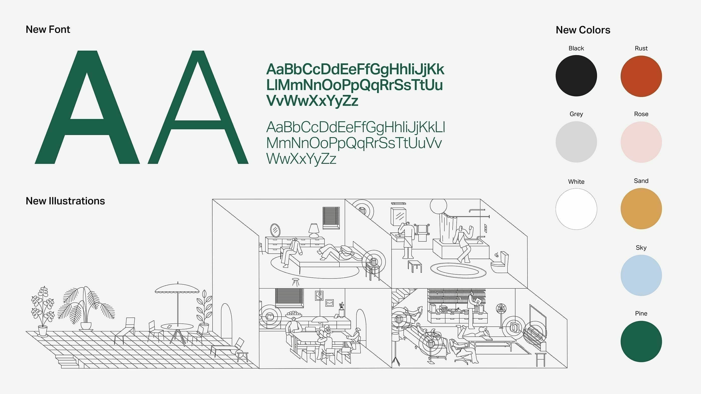
The new fonts seem to complement only certain browsers and operating systems, and are a setback on a lot of others, especially on Windows machines. As has been said before, the SE users all need different settings to be comfortable. I'm therefore proposing that this should be made an option in our preferences, or that the design team consider different fonts. It shouldn't be difficult, as this change hasn't affected sites with custom fonts; so please consider this.
Add the font changes as options in our preferences
This topic has been closed for further comments. You can use the search bar to find a similar topic, or create a new one by clicking Create Topic at the top of the page.
Enter your E-mail address. We'll send you an e-mail with instructions to reset your password.

