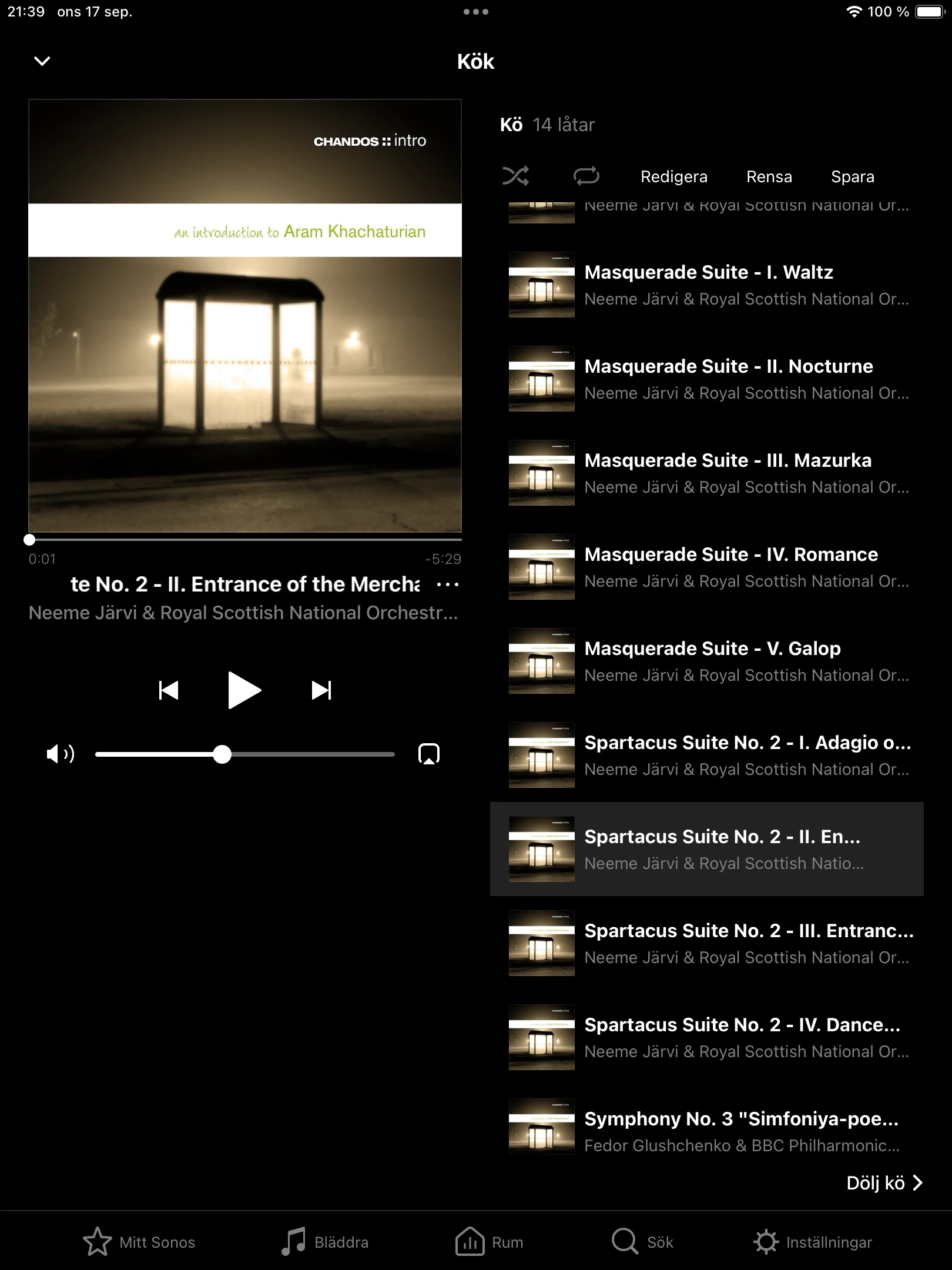
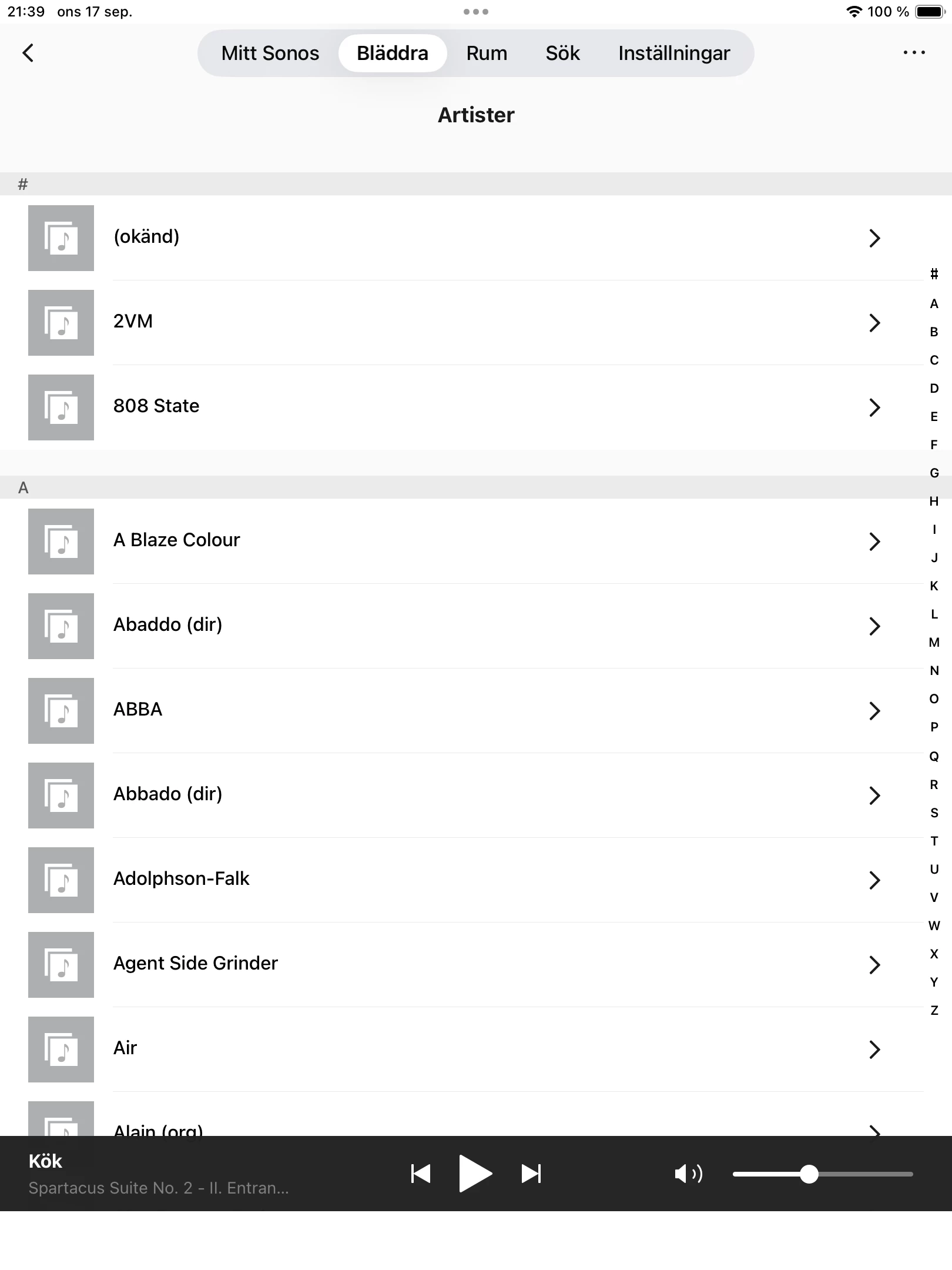
So, depending on page in the S1 app the menu is either placed at the bottom and consistent with the rest of the page, or in most cases the menu is instead at the top, with some kind of ”new” look, not consistent with the design and also leaving the place at the bottom, where the menu used to be, blank. I see absolutely no benefit here. What was the idea behind this change? It’s not like this on iPhone.