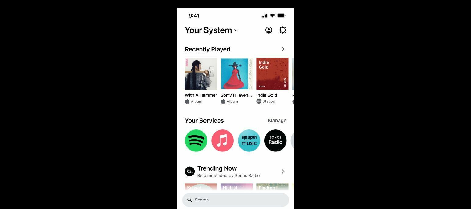
Today we are introducing the most extensive app redesign ever, creating an unprecedented streaming experience that allows listeners to organize their favorite playlists, stations, albums and more from over 100 services on one customizable Home screen.
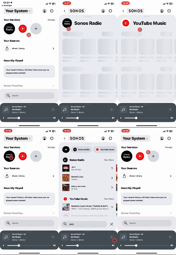
 

Home Screen

The new Home screen provides faster access to Sonos system controls with one easy swipe up, making tab to tab jumping a thing of the past. As a leader in sound experience that’s focused on creating a better way to listen, Sonos intentionally redesigned the app on a modern software platform for an easier, faster and better experience that can support more rapid innovation.


The reimagined app supports all existing S2 products and will be available globally through a software update for the S2 mobile app.


100+ streaming services, one Home screen

The redesigned Sonos app prioritizes a listening experience that’s human - allowing you to bring your true favorites front and center and giving you more control to make your streaming experience your own.


  • Get into your music (and off the app) faster: No need to tap between tabs — the new Home screen serves up all your favorite content and controls, all in one place. Quickly jump back into your recently played, browse libraries and recommendations from your preferred services, and fill your home with music and all the sounds you love.
  • Customize and curate: Enjoy unparalleled curation by designing your Home screen to reflect how you listen. Pin rows of your favorite content and services; then move, edit, or rearrange them to your liking.
  • Search every streaming library: Look for an artist, song, podcast, or audiobook across all your preferred streaming apps at once via an easy-to-use search bar that’s always available right on your Home screen.
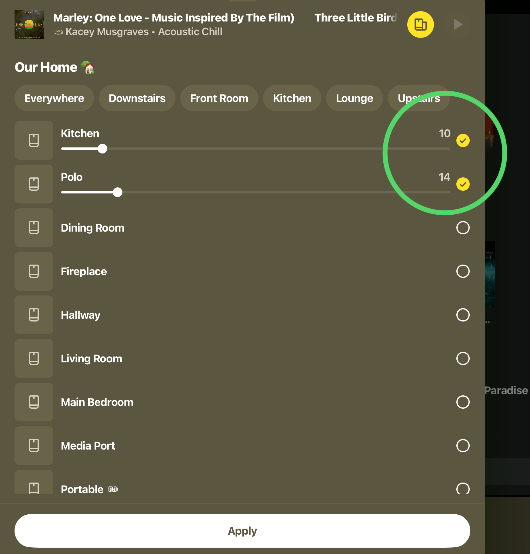
  • Elevated system control: Swipe up from the bottom of your Home screen to seamlessly control your entire system and access a visual overview of what’s playing on each of your products, quickly group speakers, and dial in on the perfect volume from anywhere in the app. 


Accessible from any modern web browser, a brand new web app allows listeners the same seamless system control as the mobile app.
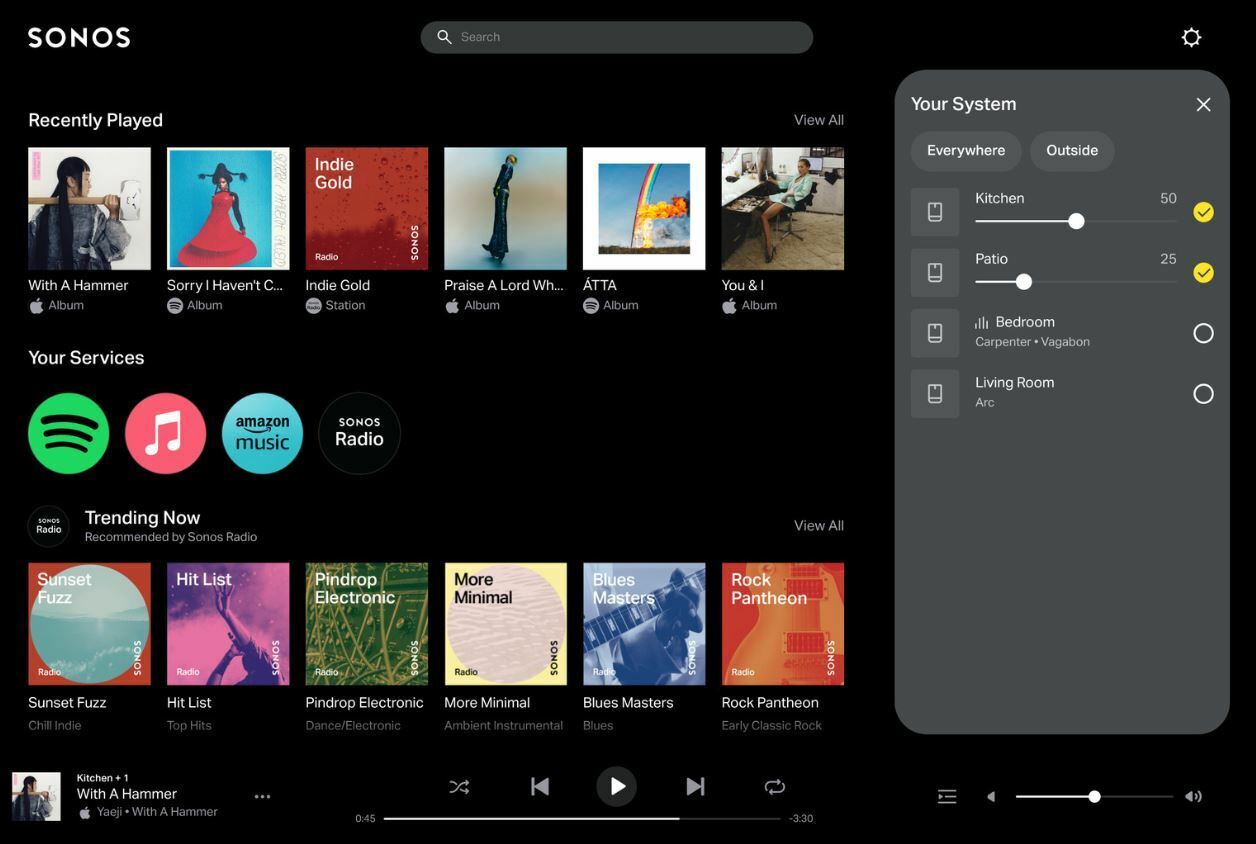
 

The new Web App

The Web App will be available alongside the redesigned mobile app on May 7, 2024.


Want to find out more about the new Sonos App? Have a look at the Info Hub section of the community for a complete rundown of the new user interface.


Here you can find the full press release. 


To anyone reading this DO NOT UPDATE! My system is virtually unusable now. Most of the music on my network drive is NOT recognised, ALL MY PLAYLISTS ARE GONE, alarm can’t be set and - very annoying - the volume control no longer has numbers so it’s impossible to choose the exact volume you want or need. How could Sonos release this update without consulting loyal customers? Totally unacceptable and shocking. I’ve long since wanted to sell my Sonos speakers - having been a customer for 20 years with regular new purchases - but today is the day: eBay awaits.


I have a Ray soundbar and I can’t find any way of turning Night Mode or Speech enhancement on or off? Or is it just hard to find?


I have a Ray soundbar and I can’t find any way of turning Night Mode or Speech enhancement on or off? Or is it just hard to find?

Click top left of the home screen, then select the room that the Ray is assigned to, so that room is full screen. Play some TV content and you’ll see Night Sound, Mute, and Speech Enhancement buttons on that screen.


I have a Ray soundbar and I can’t find any way of turning Night Mode or Speech enhancement on or off? Or is it just hard to find?

Click Home Sonos, then select the room that the Ray is assigned to, so that room is full screen. Play some TV content and you’ll see Night Sound, Mute, and Speech Enhancement buttons on that screen.

Thank you! Although I wish they were in the settings section like they used to be.


@Magicrevolver 

I’m fairly sure Night Mode and Speech Enhancement were always buttons on the Now Playing screen, showing the TV icon. I could only ever toggle them on and off via that screen. 


I have only tried the new Web app and like other am not happy with all these missing functions. 

I'm gonna hold off updating as long as possible.

This update with all these missing functions makes me wonder what the beta testers actually thave been testing all this time 🤔


@Rhonny To be honest it’s a while since I changed those settings but I remember them also in the Ray settings, along with Truplay etc. (I’m on iOS) but I may be wrong. Thanks anyway.


Apologies if this has been raised already, didn’t look up every post in this thread: but would it be possible to bring back the “Volume numbers” for the Volume Slider which have been removed by introducing the new App design?

I am talking about the numbers directly below the Volume slider (10 …. 25 … 70 … 100) when changing the volume. This was always helpful to maintain a consistent volume. By removing these, all you can do is just guess when adjusting the Volume slider.

Why was this removed with the new App anyway?


@Rhonny To be honest it’s a while since I changed those settings but I remember them also in the Ray settings, along with Truplay etc. (I’m on iOS) but I may be wrong. Thanks anyway.

It’s hard to remember where all the good stuff was!! Ah, the S2 app. It seems like only yesterday we were enjoying an intuitive user experience…


Apologies if this has been raised already, didn’t look up every post in this thread: but would it be possible to bring back the “Volume numbers” for the Volume Slider which have been removed by introducing the new App design?

I am talking about the numbers directly below the Volume slider (10 …. 25 … 70 … 100) when changing the volume. This was always helpful to maintain a consistent volume. By removing these, all you can do is just guess when adjusting the Volume slider.

Why was this removed with the new App anyway?

+1 from me, but just to add -  I do see the volume level numbers appear in some areas of the App, for example, they show on the ‘room grouping’ screen - see screenshot:


I like it. My use case is mainly Apple Music and BBC Sounds, my Local Music Library was depreciated a couple of years ago . The UI is more inline with Apple Music App, where my playlists are curated, so its probably easier to adopt if you are used to Apple Music.

I had to spend a minute or two to find the alarm settings, as was used to the icon on home page on the S2 App.


I just upgraded to the new app. I immediately found I couldn’t add a song to an existing Sonos playlist. I rang the helpline and was told this is a ‘deferred feature’ which will be made available ‘soon’! I think it’s incumbent on Sonos to contact its user base and tell us what features are deferred and for how long. Otherwise they’ve ‘sold’ us an all-singing, all-dancing fancy upgrade with significantly less functionality than the old one. That is pretty poor customer service.


Hi everyone!

I updated the app this morning (HUGE error) and I have realised that I cannot add songs to the queue or select to play that song after the song is currently playing.
How is it possible that an app that it is 99% used to stream music and manage playlists is not offering this option anymore?

Am I missing something?


Apologies if this has been raised already, didn’t look up every post in this thread: but would it be possible to bring back the “Volume numbers” for the Volume Slider which have been removed by introducing the new App design?

I am talking about the numbers directly below the Volume slider (10 …. 25 … 70 … 100) when changing the volume. This was always helpful to maintain a consistent volume. By removing these, all you can do is just guess when adjusting the Volume slider.

Why was this removed with the new App anyway?

+1 from me, but just to add -  I do see the volume level numbers appear in some areas of the App, for example, they show on the ‘room grouping’ screen - see screenshot.

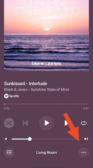
Thanks, I wasn’t aware of this @Ken_Griffiths - well, if the numbers appear in the room grouping screen, then why were they removed in the main screen with the main volume? I am talking about this screen where the volume number indicator is missing since the new app update - Sonos team: please bring it back!

Missing volume number on volume slider


I like it. My use case is mainly Apple Music and BBC Sounds


Are you finding that most of the thumbnails are blank when you click on BBC Sounds under Services..?


I like it. My use case is mainly Apple Music and BBC Sounds


Are you finding that most of the thumbnails are blank when you click on BBC Sounds under Services..?

Yes, but I have the stations I listen to pinned to home page in Sonos Favorites, with nice big station logos.


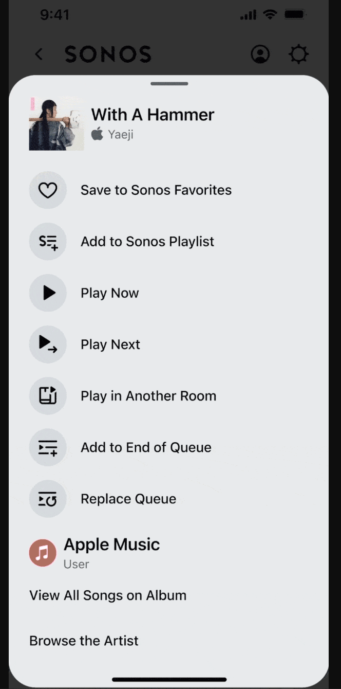
The worst part of all this for me is that Sonos know what capabilities people use and simply chose to release without them. They appear in the screenshot on their promotional page so will presumably show up eventually - see the capture below. They just preferred meeting their self-imposed release deadline to respecting and serving their customers.


I like it. My use case is mainly Apple Music and BBC Sounds


Are you finding that most of the thumbnails are blank when you click on BBC Sounds under Services..?

Yes, but I have the stations I listen to pinned to home page in Sonos Favorites, with nice big station logos.

I see the missing BBC icons too - I’m sure that’s just a minor matter and will get fixed at some point - but at least all is working.


The worst part of all this for me is that Sonos know what capabilities people use and simply chose to release without them. They appear in the screenshot on their promotional page so will presumably show up eventually - see the capture below. They just preferred meeting their self-imposed release deadline to respecting and serving their customers.


Amazing! How a product management team can decide to roll out this shit instead of waiting and release it with the core functionalities that are used by 100% of the app users?
Congrats SONOS! what a nice move!


Life is so peaceful for those of us that use S1.


I've decided that after many years with Sonos, I'm not going to buy anything else of this brand. I started with a couple of ZP90s and a ZP120 and then added Play1 and the later generations of this speaker whatever they may be called now and then added a Roam. I will just continue using my existing speakers until they stop working and will not replace with newer Sonos hardware going forward.

When the S2 software was released I could no longer use my ZP units or my 2 Sonos Control units but Sonos promised that the S2 version would allow them to make the software so much better. Since it was released it has hardly changed from the day to day usage point of view for the way I use it and that disappointed me as I sacrificed my beloved original hardware for this version.

Now they're doing it again - releasing software and promising more to come in the future. Frankly I just don't believe them. There are quite a few things missing from this version for editing queues and searching for music on your own system. They say these things will come later, but given their past performance I have no faith in them at all.

Before retirement I spent 30+ as a commercial software developer and never in all that time did we release a version with missing features.


I don’t yet have access to the new mobile app, but I have just tried the new web app.

A few observations

  • Interface looks nice and is intuitive but it seems extremely sluggish.
  • It's annoying you can't use the web app without signing into Sonos.com account. I don't really want to give everyone living in my house my Sonos.com login credentials. Although it seems you can’t do any system admin from the web app, the credentials would give system admin rights if used with a mobile app.
  • As others have noted, its annoying that you can't search local library.
  • Its annoying that you can’t clear the queue.
  • It’s annoying that you can’t re-order the Favorites sections.

Have just noticed that if I power on a speaker whilst the web app is running, the speaker doesn’t automatically appear in the list of speakers in the web app (unlike the desktop and mobile apps in which it appears a few seconds after powering on). The speaker did appear after I relaunched the web app. Possibly refreshing the page would have been enough too, but I didn’t try that. Either way, please fix so that newly powered on speaker appears automatically without relaunch/refresh.


It is almost as if Sonos thinks that its users don’t have enough excitement in their lives, that they unleashed this on users, unwary or otherwise.


Can’t manage alarms with the new iOS app!  When will this be fixed?  The new Sonos CEO should be fired.  I have worked in technology for over 25 years and I have never seen a disaster like this.