

This topic has been closed for further comments. You can use the search bar to find a similar topic, or create a new one by clicking Create Topic at the top of the page.
Page 1 / 7

Hello all
It's great to see so many responses to this topic about improving the quality of the Sonos app.
There were many topics on the forum started by others about this issue as well.
The Sonos team has made a welcome improvement to the Now Playing screen. Now it is good. Easy to look at close up or at some distance, in dim or bright ambient light.
In my opinion the dark background looks like a quality product, designed for what we use it for.
Please make all the rest of the pages in the same style. The product can look well made, consistent and finished.
Once it's all tidy, please keep it that way.
Thanks to Sonos for the improvements, and thanks forum users for your responses.
Userlevel 3
Thanks and kudos to Ryan and the Sonos team. The new black Now Playing screen is a huge step in the right direction. I'm looking forward to seeing the next round of improvements!
In terms of color they may be trying a little bit to get out of that blind alley, but for the navigation they stubbornly keep pushing forward with a flawed concept. Because the product managers believes in it. As a result the now playing screen is suddenly a cluttered mess or worse (on smaller screens)..
Sonos market themselves as a premium product so I don’t think anyone should hold back from being critical if it doesn’t live up to expectations.
Fully agree, the way they deal with design is plain amateur hour. Case in point is indeed the Spotify app, where the now playing screen is a breath of fresh air in comparison with Sonos 8.3.

Obviously it is somewhat better now.... But glad to see they promise more improvements....
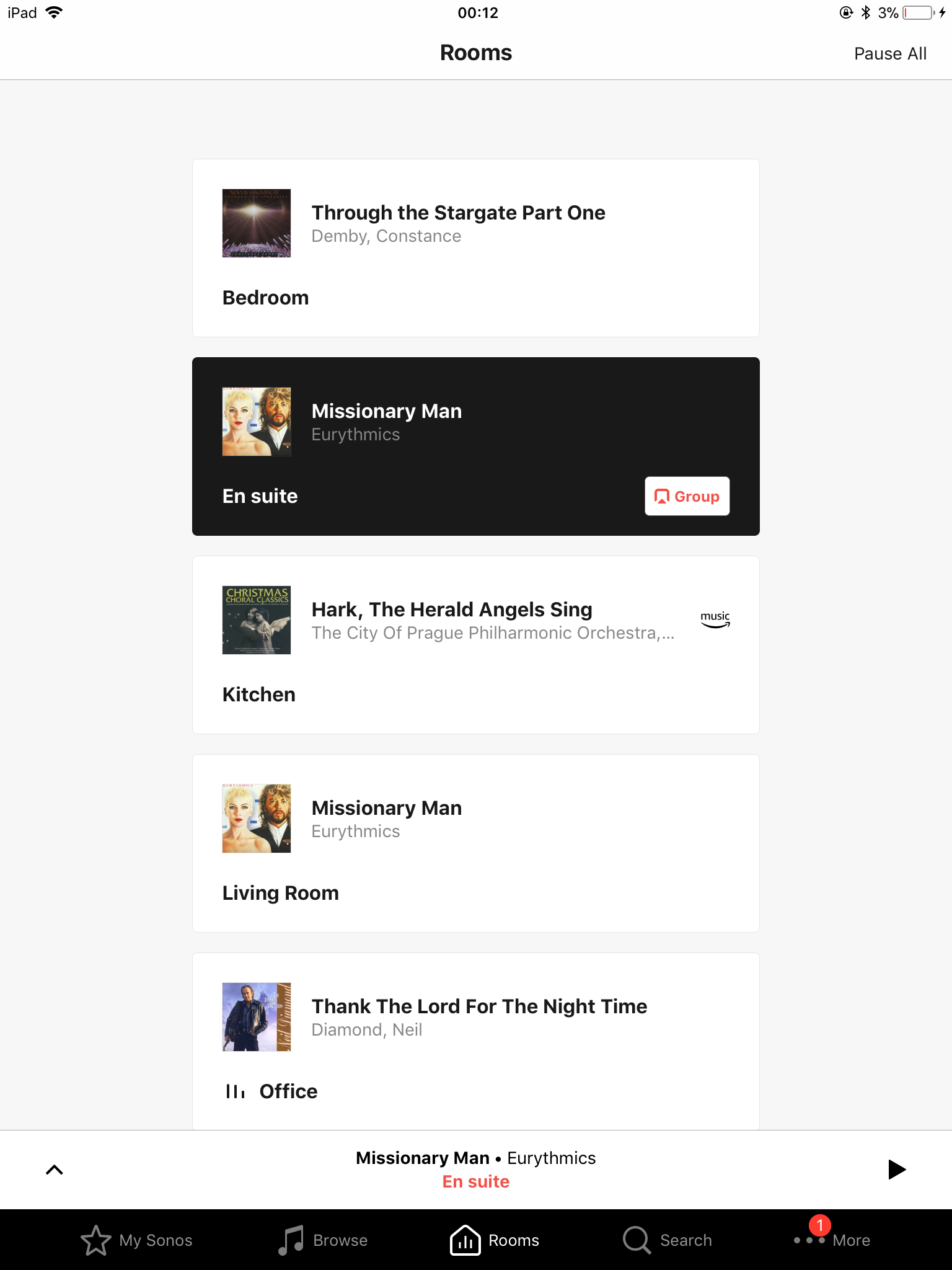
The now playing screen is better in black but it looks so bland. Wouldn’t mind so much if it wasn’t for the fact I remember the app used to look very nice in the previous version. Can’t really remember exactly what it used to look like however, does anyone have a screenshot?!
The contrast between Spotify and Sonos is massive. You have to say that Sonos doesn’t look ‘clean’, it sadly looks amateur!
Sonos market themselves as a premium product so I don’t think anyone should hold back from being critical if it doesn’t live up to expectations.
Userlevel 2
Yes yes yes Thank you so much for the latest update. Black is back!
Userlevel 7
 +21
+21
Wow you peeps are wonderfully encouraging! Sonos clearly went down a blind alley with version 8. This is a step back in the right direction and they are looking for feedback before making further changes. The big usability fix of the navigation is there and very welcome and other changes are afoot, as per the release notes.
Charges to consumer software takes time and sometimes has to be done in smaller steps than even the developer would like. There is no need to be so dismissing, is there?
Charges to consumer software takes time and sometimes has to be done in smaller steps than even the developer would like. There is no need to be so dismissing, is there?
Userlevel 2
Seriously? This is the fix? A black background on the now playing screen but still eyeball destroying white on all the other screens? It’s still bland with small album cover artwork. As Keeper said above, I’d love to see the results if you were taking it easy. Such a disappointment. Here’s a hint, look at the SPOTIFY app and do that, or better still, just bring back the version before this mess, you know, the one that worked well and looked nice, just saying.

If that’s hard at work I’d hate to see what happens if they are taking it easy.
That is a really underwhelming update, I was expecting far more, I guess it shows the quality of the developer.
That is a really underwhelming update, I was expecting far more, I guess it shows the quality of the developer.
Userlevel 7
+22
Since I spend 99% of my time on the now playing screen fixing it has solved most of my glare problem. I'd like the other screens fixed too but I'm happy to see what we got.
How is that a step forward? Now Playing is now black, but it return Rooms is even more white then before, while the rest of the screens remain untouched ( and thus white).
Userlevel 7
+26
Hi everyone. The team has been hard at work incorporating your feedback to the Sonos app and 8.3 is now available. For details on what's changed, take a look here.
Unbelievable that they would take away the dark mode?!?!?
They obviously don’t use their own app in the bedroom?!?!?
They obviously don’t use their own app in the bedroom?!?!?
There's no denying that phones are the primary device these days. especially on the go. At home you will find a - if not several - tablets though as they are better to lean back with, or use as a second screen.
As Sonos is typically found at home, the case for a tablet interface is likely bigger than average device usage stats might indicate.
Userlevel 3
 +1
+1
My initial thoughts as well. However the Sonos ‘universal search’ is also limited and the SonoPad search engine has some benefits over Universal search that made me change my mind about it.
Universal search does search across multiple libraries, but you have to manual select artist, track, album, etc. to find what you are looking for.
The search function on SonoPad works differently; first you select the library you are interested in (on local network, Deezer, Radio, etc) and once you key in your search string it search within that library for artist, album, track, composer, etc all at once and shows the result under artist, album, track, composer, all in the same view. I’ve found that really useful, actually more useful than the Universal search especially for classical music.
I hope one day these two search functions will be combined to a real Universal search.
Well to be honest, there shouldn’t be any benefit in theory. That’s if the phone / tablet app was as it as it could be. However Sonos has apps for IOS and Android and has to cater for multiple OS versions and screen sizes, etc. As above, I suspect that Sonos has catered for the lowest common denominator. Use is not made of larger screens or landscape mode. Writing for a dedicated Sonos controller would be easier when the hardware was known and locked down. Small tablets are so cheap these days, it probably Could be made for less than a Play 1.
Andrew
Andrew
The line of thought may be why bother with tablet mode when (almost) everyone has a phone in their pocket.
Tbh im of this mind.
Userlevel 7
+22
What would be benefit of sonos made controller vs a dedicated cheap tablet?
I'm not exactly a fan of winding up with a house full of - now even more advanced - remote controls again. Even though that appears to be the trend. Who didn't wind up with a Philips hue physical controller, if only to make sure the cleaning lady can turn the light on? :)
If they'd take tablets into account upfront, instead of an after thought, it shouldn't be much of an issue to support. Heck they already did/used to. And the same goes for supporting a dark mode (although it probably should be the default), switching the colors around a bit isn't exactly a big deal.
Clearly there is a cost issue in developing for multiple platforms (Windows, IOS, Android), and then for different screen sizes (phone, phablet, tablet), and then landscape and portrait). I guess modern multi-platform development tools that work for the lowest common denominator (ie smallest screen) is the cheaper way to go. .
I guess tablets are not for everyone but the old landscape app on the Ipad had a a real tangible sense of luxury about it.
With low power no-name tablets being so low cost nowdays (£50 isn't uncommon), maybe it might be worth Sonos considering buying in the hardware and selling a dedicated controller again with software they can write to maximise the potential of its larger screen. They can continue to write for the IOS / Android a more generic app. I could then forgive it looking like it does on my Ipad :-)
Andrew
Userlevel 7
+22
Other than the search bar at top not being a universal search. I find the desktop to be the perfect landscape view.
Nope user choice of software version for the speakers we own is not supported by Sonos.
I daren't update my PC App as its telling me to, because I don't know what it will do to it, has anyone updated yet and has it changed the interface on that aswell or is it still ok?
Userlevel 7
+22
While I like the idea of the navigation at bottom (reminds me of older Sonos apps), I do think going back to version 6 they have put no thought into the landscape tablet mode. It’s just a spread out version of portrait mode. They are missing a lot of opportunity to make it a much more functional interface (as can be seen in the old version on desktop). I think there priorities continue to be elsewhere but landscape mode has so much potential.

And a bit more like, oh I dunno ... this ?

The bottom one was done by an amazing company called Sonos.
No comparison, really ! :D
Andrew
Andrew as many know I have defended the notion that the current app is usable while not better than the previous. I have managed with it ok. However, your simple comparative pictures though make the most compelling case. The older version is certainly a better and more appropriate interface for multiform use. Any objective assessment would come to that conclusion. The former approach gave you a more holistic dashboard - a clear sense of where you are and options for your musical experience.
I recognize that Sonos for whatever reason wanted an interface that followed Spotify, Apple and Deezer. But it really is not necessary and no one in Sonos has really provided a logical reason why it is.
So its a New Year and I do recognize that Sonos is trying hard to grow its business and please new and existing customers. Its a tough ask. I have decided to now support those calling for a reversion to an interface without a navigation bar. It is the better approach. Again I can use the navigation bar as I use both Apple Music and Deezer so I am comfortable with it. In the end though Sonos should not ape for the sake of aping and change for the sake of it. This is not a change for the better in terms of a multi room set up.
I do not think having a visible navigation bar at the bottom even on Now Playing screen really fixes anything.
So after much discourse I will support reverting from the navigation bar. While I will live if this does not happen I am a big man who can change his mind and support the right thing.
Sonos please recognize that you are not a regular streaming service but a multi-room set up. You offer a different value proposition and should have a software experience that supports it in the best way and the navigation bar approach is not it. It really isn't.
I don't know the full scale of your limitations but give deep thought to the way forward. Leaving pride aside.
The desktop interface doesn't have universal search either, but I quickly got used to it again.
It'll depend a lot on being able to rely on a single source (e.g spotify) which can be selected upfront, or having to use 2 or 3 different ones with widely varying catalogs.
Userlevel 7
+22
I had tried a while back but no universal search was its big issue for me.
Page 1 / 7
Enter your username or e-mail address. We'll send you an e-mail with instructions to reset your password.