s2 app ui

  • 17 December 2021
  • 12 replies
  • 128 views

Userlevel 2
Badge +7

Hi all , been using the Sonos S2 app for a couple off weeks now , not sure if there's a suggestion thread but perhaps the app UI could be made to look a big nicer / classy ?? Tbh it looks boring and compared to the Yamaha I've come from the Yamaha one looks way better , the colour theme for the room runs through the app , Yamaha one seems to be easier to navigate too 

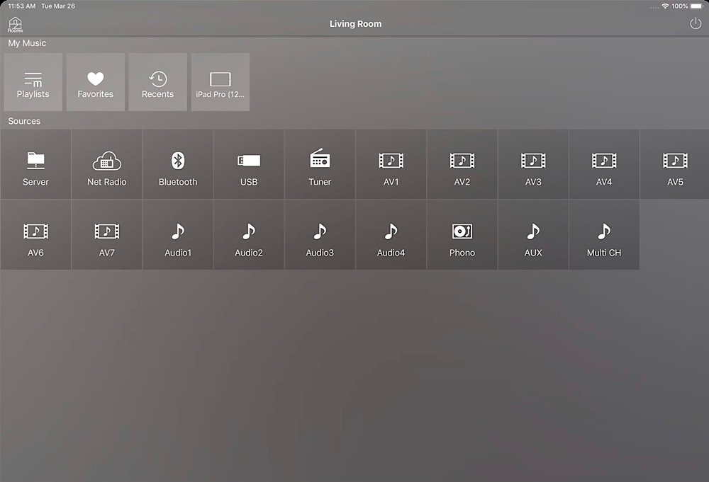
Sonos app is just white or grey , needs to be made to look nicer to match the quality of their speakers etc , I've attached pictures so you can see .

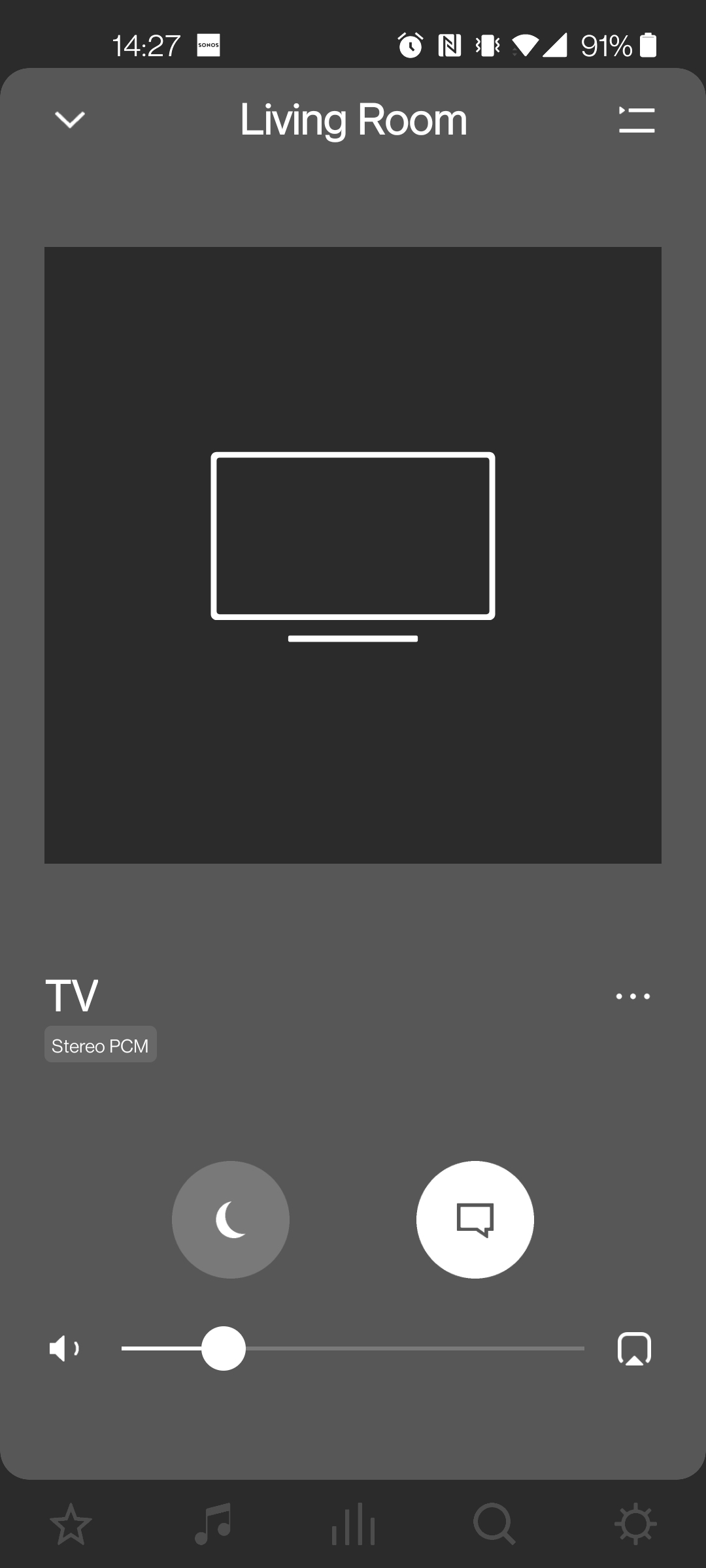
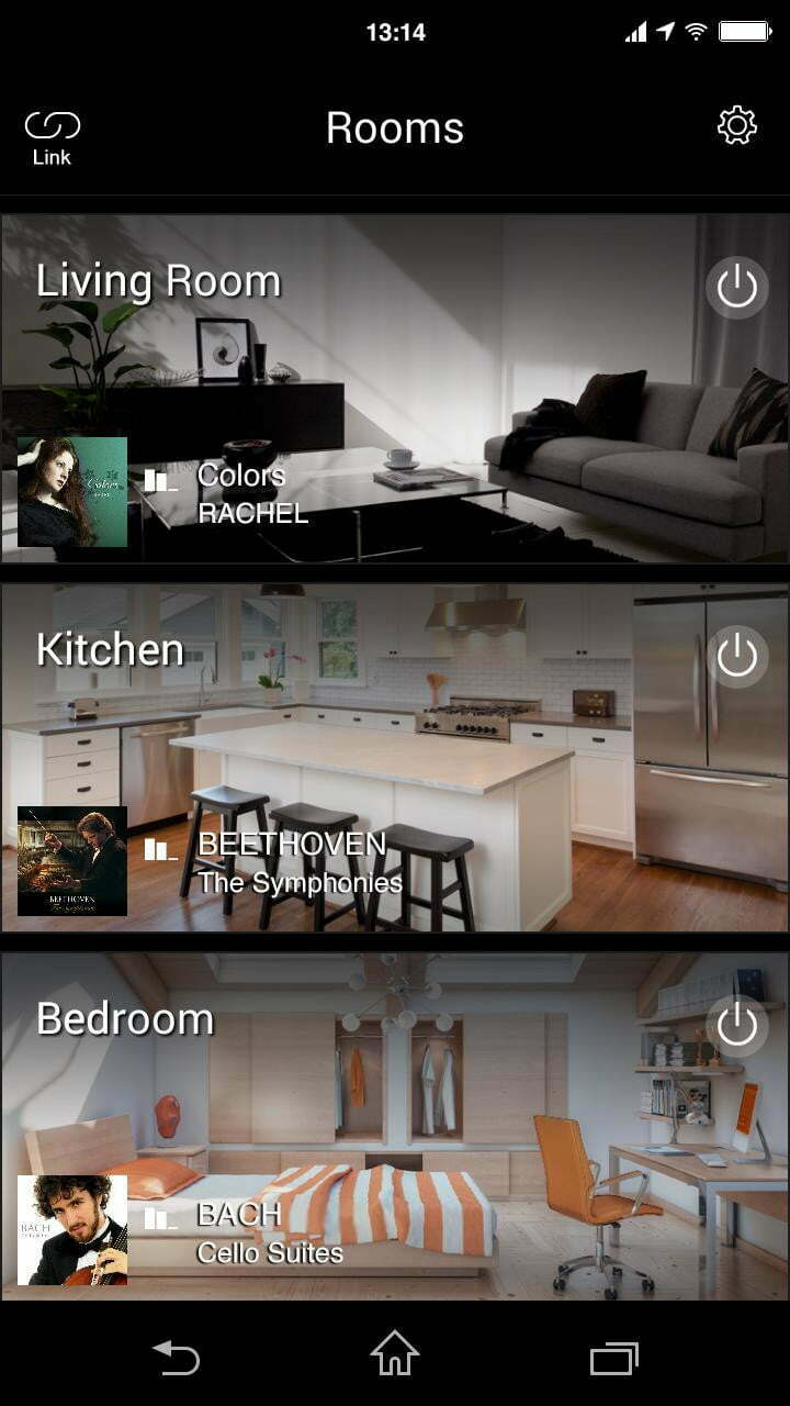
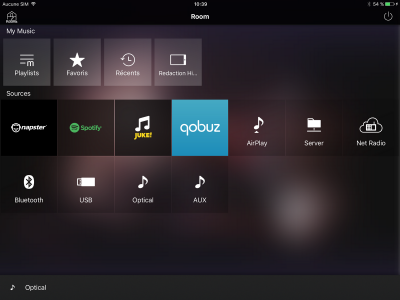
Top is Sonos , middle and bottom Yamaha .


12 replies

Are those your own room photos in the Yamaha app? If not they’re pretty irrelevant. 

You happen to have chosen the Sonos Now Playing screen (TV) which is pretty stark and functional and, I’d suggest, rarely looked at other than to change night/speech modes or check the format. The standard Now Playing for music, with artwork and colour-coordinated background is more lively, and similar in style to other media apps.

Userlevel 2
Badge +7

Are those your own room photos in the Yamaha app? If not they’re pretty irrelevant. 

You happen to have chosen the Sonos Now Playing screen (TV) which is pretty stark and functional and, I’d suggest, rarely looked at other than to change night/speech modes or check the format. The standard Now Playing for music, with artwork and colour-coordinated background is more lively, and similar in style to other media apps.

No they are photos built in to the app for the user to use or you can use a photo from your device , the music playing screen is similar to the Yamaha one but I just think a nice classy colour theme running through the app would make the UI a bit better 

Perhaps you’d care to provide some examples, other than a rooms menu (with or without photos, which TBH are a bit of a gimmick)?

As it is, the controller backgrounds are regulated by the light or dark theme. The principal colours come from the track art itself, and/or the services themselves (icons etc).  I don’t quite see how a ‘nice classy colour theme’ would fit in with that.

Yes, just one click of a button and the Sonos App ‘now playing’ screen shown in the opening post can change to something more colourful, like this example…

Whist the Yamaha App can be shown off like this…

We can all try to manipulate/twist things to suit…

Userlevel 2
Badge +7

Perhaps you’d care to provide some examples, other than a rooms menu (with or without photos, which TBH are a bit of a gimmick)?

As it is, the controller backgrounds are regulated by the light or dark theme. The principal colours come from the track art itself, and/or the services themselves (icons etc).  I don’t quite see how a ‘nice classy colour theme’ would fit in with that.

The bottom pic are the tiles that you select in each room , seems like you're a bit defensive of the Sonos app , got to admit the Yamaha UI looks better than the Sonos UI , might be a bit of a gimmick but just looks better than a boring grey . Was only a suggestion to try and make the UI of the Sonos not as grey looking .

Userlevel 2
Badge +7

Yes, just one click of a button and the Sonos App ‘now playing’ screen shown in the opening post can change to something more colourful, like this example…

Whist the Yamaha App can be shown off like this…

We can all try to manipulate/twist things to suit…

Im not trying to manipulate or twist anything , the now playing screen for music looks fine , just thought for TV something a bit nicer . If you just use stock background in Yamaha you just get the grey but you can change it , that's all I'm saying , not trying to upset anyone ....

The bottom pic are the tiles that you select in each room

Which doesn’t look that different from the Sonos Browse menu, with all its coloured icons for each source.


seems like you're a bit defensive of the Sonos app

Not really. It’s functional, and reasonably elegant. I just can’t see anything especially appealing about the Yamaha app. 

Userlevel 2
Badge +7

The bottom pic are the tiles that you select in each room

Which doesn’t look that different from the Sonos Browse menu, with all its coloured icons for each source.


seems like you're a bit defensive of the Sonos app

Not really. It’s functional, and reasonably elegant. I just can’t see anything especially appealing about the Yamaha app. 

Which I was basically saying a colour theme would be nice , some users might like it , some might not , personal choice ..…

There's nothing " appealing " about both tbh I just think that a bit of a colour theme or customisation would be nice .

So ... you’re talking about the other menus, not Now Playing (which as explained is self-coloured, driven by the artwork).

Personally I use the other menus to do stuff: select rooms, browse services, choose music, edit the queue, tweak settings, etc. I’m there for a purpose. Now Playing is the only screen I’d stare at for any length of time, and that’s already catered for.

Userlevel 2
Badge +7

So ... you’re talking about the other menus, not Now Playing (which as explained is self-coloured, driven by the artwork).

Personally I use the other menus to do stuff: select rooms, browse services, choose music, edit the queue, tweak settings, etc. I’m there for a purpose. Now Playing is the only screen I’d stare at for any length of time, and that’s already catered for.

As I put in my first post , the colour theme runs through the app so it's used for all screens apart from the music playing because that's album art , the now playing if it was on TV setting would have the colour theme and not just grey .

Im not trying to manipulate or twist anything , the now playing screen for music looks fine , just thought for TV something a bit nicer . If you just use stock background in Yamaha you just get the grey but you can change it , that's all I'm saying , not trying to upset anyone ....

I thought you were referring to the Sonos App in general - I find it okay and colourful/easy to use - it could be quicker in places, but I suspect my old iPad, in general, could be quicker too. I need to upgrade it, perhaps🤔?

The Sonos App features work well and I’ve got quite used to it .. the TV ‘now playing’ screen is sparse, but functional. I don’t use it anyway (truth be told), as I’m usually looking at the TV screen, rather than the App and can access night mode and speech enhancement (if needed) when that screen is minimised anyway. It’s not a huge need to change this for my own use-case.

Userlevel 2
Badge +7

Im not trying to manipulate or twist anything , the now playing screen for music looks fine , just thought for TV something a bit nicer . If you just use stock background in Yamaha you just get the grey but you can change it , that's all I'm saying , not trying to upset anyone ....

I thought you were referring to the Sonos App in general - I find it okay and colourful/easy to use - it could be quicker in places, but I suspect my old iPad, in general, could be quicker too. I need to upgrade it, perhaps🤔?

The Sonos App features work well and I’ve got quite used to it .. the TV ‘now playing’ screen is sparse, but functional. I don’t use it anyway (truth be told), as I’m usually looking at the TV screen, rather than the App and can access night mode and speech enhancement (if needed) when that screen is minimised anyway. It’s not a huge need to change this for my own use-case.

Thats fair play and personal choice, after coming from the Yamaha app which ( I think ) looks that bit nicer I just thought the Sonos app looks a bit bland , that's all , I'm not criticising the Sonos app I just think a setting to choose a theme would be nice .

Reply