
This topic has been closed for further comments. You can use the search bar to find a similar topic, or create a new one by clicking Create Topic at the top of the page.
Page 1 / 4
Userlevel 2
 +1
+1
To me the interface scheme change is horrible.
I get interface improvements, but this wasn't one.
The colors are awful, and are hard coded so you can't change them.
They took a perfectly suitable button that said "group" and changed it to an icon
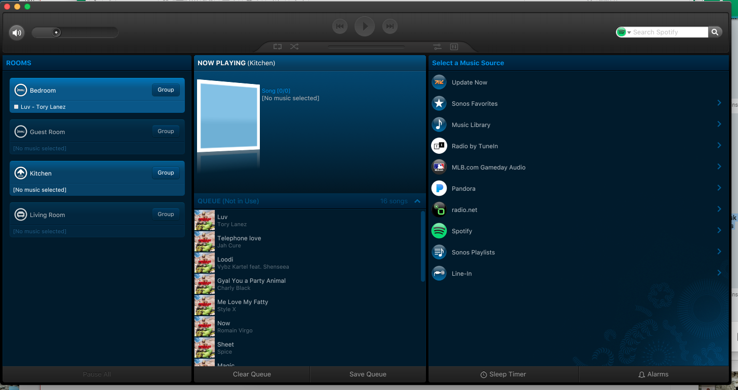
Poor design, the icons for the main source navigation are less clear in hard b&w plus they seem to be smaller.
Whoever thought this was a good "upgrade" needs a dope slap.
Userlevel 2
+1
Ugg. This 9.2 update is freaking HORRIBLE.
It is ugly as sin, and hard to read. The old colorway was MUCH MUCH better, and the idea the color scheme is locked to this nightmarish black and white controller scheme is terrible.
Software should be functional, and if you change the colors, you should have an option to use the old theme, not force me to change how I interact with it. Terrible design, the controller is much less friendly to use, and just looks like a big flat black window now,
Very poor, seriously thinking about force downgrading my controller on the Mac because this is so damned ugly to look at.
What were you guys thinking, generally speaking an upgrade improves the experience with Sonos. Big failure this time.
Userlevel 1
Has anyone found the new Windows app takes a long time to close? On my system it hangs for around 9 secs when you click the X top-right before closing.
Another one who intensely dislikes the new black desktop app. On my other computer, I have opted to ignore the 'update' nag, and have noticed that many of my options are now disabled such as Music Library Settings and Update Music Library. How dare you, Sonos? You come into my home and mess with my stuff! I have more Sonos speakers than I can count right now, and have had them for years. When I first started out, Sonos had a little controller that you put on the wall. They then went into phone apps etc. So, when I first started out, I did NOT sign up for being forced into app updates every few months for functionality that I have ZERO interest in. I have reached the absolute end of my tether after this last hideous update and the fact that the software update broke my Sonos integration with the rest of my home automation (because they removed the DEVID data). I have now started researching alternatives to Sonos since it seems that, even though I have spent a lot of ££ on my system, it is not actually *mine* but still belongs to Sonos as they have all the control over it and I have no say about what changes, if any, I want, and how/when I want them.
It isn’t really just a scheme change. They changed the look altogether. Its very ‘flat’ and hard to read. Way too much contrast. Or something.
Desktop Controller for Windows v9.2 no longer seems to honor the last closed program window size & positioning.
When launched on my 4K resolution PC monitor, the program opens as a HUGE "placemat" dead center every time, swallowing up the bulk of screen real estate.
What is the rationale behind this UI design change, or is it merely coding oversight?
When launched on my 4K resolution PC monitor, the program opens as a HUGE "placemat" dead center every time, swallowing up the bulk of screen real estate.
What is the rationale behind this UI design change, or is it merely coding oversight?
Totally agree, the loss of all system settings is the real let down for me. Ridiculous.
Combined with the fact my Sonos One integrations with Alexa are constantly failing and my Connect:Amps now don't get new features. I have to pay $10,000+ to upgrade my system to the new Amp. Well, I'm ready to sell all of my Sonos Gear and buy Echo Link Amps for less than half the price with better integration. Really sad to see Sonos fall off a cliff like this. Seems like they are alienating all of the customers that got them where they are.
Combined with the fact my Sonos One integrations with Alexa are constantly failing and my Connect:Amps now don't get new features. I have to pay $10,000+ to upgrade my system to the new Amp. Well, I'm ready to sell all of my Sonos Gear and buy Echo Link Amps for less than half the price with better integration. Really sad to see Sonos fall off a cliff like this. Seems like they are alienating all of the customers that got them where they are.
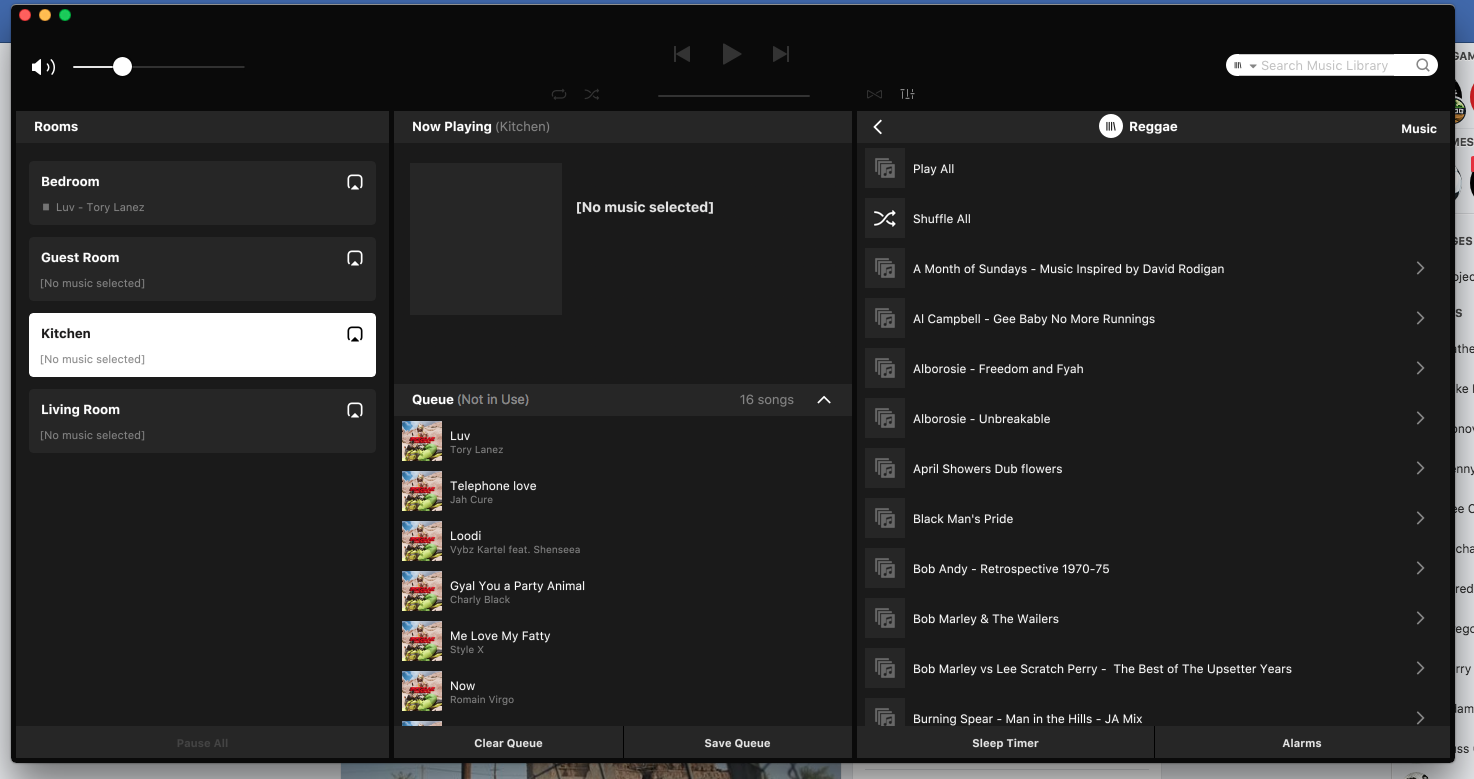
The PC Controller update is horrible. Please add a skin button so we don’t have to look at this monochrome display. The PC Controller was the last saving grace for me because they destroyed the Smartphone app back in 8.2 so we can't find anything or manage my groups anymore, and now I have an 80's looking monochrome color scheme. I understand that things change but losing functionality with each release is total crap in my opinion. The smartphone app is so hard to use and now this. I wish I never upgraded. Can someone build another interface based on 7.0 and just leave it alone? You could call it Sonos Classic, and I would buy it because I hate this new interface. I'm thinking of pulling out my CR100 controller..............

I have spent thousands on your hardware and put up with your unintuitive controller interfaces that seemingly only get worse. You waste an ungodly amount of space causing me to scroll and flip through screens and screw around just to adjust volume or try to get to an album. And now, now you give me a color scheme that made me think the update had just freak'n failed because it looks like a DOS throwback. Who is running the show? I have talked up your system to so many people. You are embarrassing us.
Userlevel 4
+1
Agreed. A new colour scheme in line with current branding is a good idea. But the implementation is horrible. The contrast between the very dark flat shades of black doesn’t work. Some of the icons and text are too small and overall It is difficult to read and definitely not easy on the eye. Having said all that, it’s what I expected as the iOS and Android apps also have a poor look and feel.
Userlevel 1
Agreed. Dislike. I tolerate the desktop app at best and this is a confusing change. Since I haven't added hardware in a long time I've seen almost no improvement to the app. Song length? Sorting? for the love of god since you have miles of real estate for the progress slider but choose not to use it how about a 15 or 30 second skip button like every other audio app has had for years. put some people in a room and let them only use this app and ask them for their feedback.

Change for changes sake - I have only just started blocking updates - the changes to the PC Controller being the last straw. The Android Controller is now an illogical mess.
Userlevel 2
This is a terrible update. I want control of ROOMS back on the PC. The Android app is also a piece of garbage. On my kindle it is extremely SLOW. On my Samsung android phone, it is useless, can't even find my playlists. Without the PC room support it is nearly impossible to manage my eight zone setup. It took minutes for some of my 'Connect' Zones to show up and then it could'nt find parts of stereo pairs on another couple of zones. i.e Showed Office (L) so I tried to add back the Office (R), said it was already a stereo pair. Eventually it came back. Not usable anymore.
Userlevel 2
 +4
+4
Had I been on the beta-test, this had had a lot of feedback before release:
1: Why the.... did the Room Settings get removed? You _only_do that on mobile devices as a LAST resort!
2: Group room volume: If you mute one room, the speaker icon now get's a X next too it - it was MUCH easier to see it as muted on the former version, when it got 'dimmed' out.
I look at that every evening, to make sure the Bedroom is muted so the upper neighbour is able to sleep ?
3: Controller Layout:
- Why is the 'Track info text' placed in a narrow location, with a simple icon for Tune In is placed there?
It Makes No Sense!
With both Heos and Bluesound making moves in the marked, this is a huge step back.. sadly!
1: Why the.... did the Room Settings get removed? You _only_do that on mobile devices as a LAST resort!
2: Group room volume: If you mute one room, the speaker icon now get's a X next too it - it was MUCH easier to see it as muted on the former version, when it got 'dimmed' out.
I look at that every evening, to make sure the Bedroom is muted so the upper neighbour is able to sleep ?
3: Controller Layout:
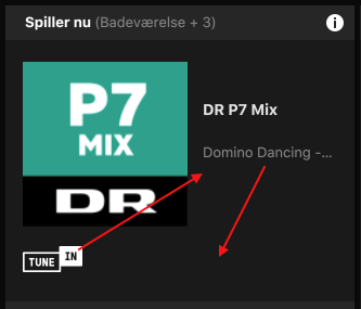
- Why is the 'Track info text' placed in a narrow location, with a simple icon for Tune In is placed there?
It Makes No Sense!
With both Heos and Bluesound making moves in the marked, this is a huge step back.. sadly!
Just noticed the update broke my connection through Spotify. Nothing works
For anyone who wants to downgrade here are the links.
http://update.sonos.com/software/mac/mdcr/SonosDesktopController91.dmg
http://update.sonos.com/software/mac/mdcr/SonosDesktopController90.dmg
Version 9.0 needs an older firmware on the speakers but 9.1 works but I noticed that they removed all the audio settings from the app, only Date/Time settings remained. Please, who the hell needs Date/Time settings in a music controller app?! What a piece of crap really...
Userlevel 1
Totally agree New 9.2 Update on PC's - Windows in Black & White, no more deep Blue, is horrible. As also noted in another Topic, the Windows based Controller no longer has the Add Player Option. I was told that this capability is now only on Mobile Ap's. I do not like the look o f the New Windows Controller at all, and don't like that I can't use a PC or Laptop to Add a Player. I understand that Sonos wants to be sure to support Mobile, as the way of the future, but why do they need to spend resources to actually Reduce the Quality of the Windows Controller !?
Read a lot of very good posts (and observations) here and seems clear Sonos has done a very poor job on this front.
No wonder their Stock is just above $12 right now.
Read a lot of very good posts (and observations) here and seems clear Sonos has done a very poor job on this front.
No wonder their Stock is just above $12 right now.
I kind of like it... It was always so jarring to go from the app on my phone/tablet to the PC/Mac and it look so different. Looking closely at it though, jgatie is right, its very much just a new paint job with some styling changes on the controls.
I like it, but I was hoping they had the ability to "skin" the player so you could opt into the new black and white or the old blue.
Userlevel 7
 +26
+26
Thanks for your feedback everyone! I'll make sure to bring it up with the design team so they can hear your voice.
Sonos reads everything, but the window issue was brought up in the main announcement thread as well. I suspect we'll see an answer to that question their before one shows up here.
Happy to answer here too. The team is looking into it, but I don't have any specific news.
Happy to answer here too. The team is looking into it, but I don't have any specific news.
I like the look and style of the new Windows Desktop. To be honest when I started reading feedback about it, I was expecting the worst but I'm pleasantly surprised. I'm getting on a bit in years these days and when software is badly presented I have to resort to reading spectacles but I find the new desktop app far easier to read than the old one 🙂
Userlevel 2
+1
Yeah but eventually you can't use the system if you don't upgrade it. It stops letting you add devices, and cool stuff like updating the library etc.
I am all for being a luddite, but they make it difficult.
I am all for being a luddite, but they make it difficult.
REVERT the GUI! And now the new one has more space around everything. Too much padding. I prefer the blue former scheme and the more compact layout. I prefer the yellow-orange against blue icons for repeat and shuffle. They stand out as selected better than white and less-white.
The new Monochrome Scheme is pure crap! Give us the option of some color. I paid thousands for this!?
If you are going to muck about with the look of the user interface for windows at least give up the optional to chane the colours or skin.
This new style SUCKS
This new style SUCKS
Spot on!
There is a change, I cannot say that I'm full of joy over it, but nor am I in rage over it. The fact that it does not remember size and position is a bummer, but I expect that to be fixed. (I only start the controller when I boot Windows which is not that often.) For me personally there is an improvement: the icon in the taskbar is different. The old icon was a little bit to similar the icon for Waterfox which I use as my web browser.
Different colours, but as Alan points out, very little has really changed.
Being able to choose the skin? Personally, I have never really had confidence in software that permits you to choose skins. But, OK, for a music player it would make sense. But, hey, would it really be Sonos if they would let us make that choice? For good or bad, that simply is not the Sonos way.
Page 1 / 4
Enter your username or e-mail address. We'll send you an e-mail with instructions to reset your password.