
New App Upgrade - HORRID
The new interface is nearly impossible to use... it doesn't even make sense how it works in relation to the previous interface which was better than good enough. As someone that has thousands of dollars invested in sonos I have to voice my utter disgust for this new app. PLs comment below and lets get Sonos to roll back from this atrocious attempt at an upgrade.
This topic has been closed for further comments. You can use the search bar to find a similar topic, or create a new one by clicking Create Topic at the top of the page.
Page 1 / 5
Userlevel 2
I never make the effort to sign up to things usally to complain. i love my sonos speakers. But this new app has driven me to it. I hate it. Not user friendly. Bring back the old. So much better. Please sort it sonos.was considering getting a new speaker but might look else where if i have to live with this sh#t app.

To sum up-very few longtime users like the update-most hate it including myself
Please allow us the ability to go back to the better/older software that made sense
Please allow us the ability to go back to the better/older software that made sense
Userlevel 4
 +3
+3
I agree - it's an insult to all my investment too. No extra features, but all of them are harder to find! I hate the bright white light theme also - bring back the black!
Userlevel 2
Personally this latest update feels like a real step backwards in user friendliness.
The 'MY SONOS' tab... Use far too much space displaying content, I always have to press 'show all' button to see what I need to, so why bother with the new BIG look?!
The 'ROOMS' tab. Again, the new layout uses to much space and makes it much more difficult to see what's playing in each room at a glance (which is surely the point?) Now only shows 3 rooms on screen, a completely unnecessary waste of space when the old layout showed much more. I would like to be able to see many more rooms/speakers.
'SEARCH' & 'BROWSE' tabs - why are there two tabs for an almost identical function?!
Another slight annoyance is when on the expanded playing screen... The new tabs across the bottom VANISH (on my phone) so there's barely any point having them if they're supposed to be short cuts... I still have to hit the tiny arrow in the top left corner to get anywhere!
On a plus, the quick grouping of rooms does seems slicker/better, but overall I'm pretty unimpressed!
I hope the rep who is from SONOS that comes on from time to time takes the PAGES of threads on the dislike of the new app back to SONOS.
Userlevel 4
 +1
+1
Yea, most users hate it.
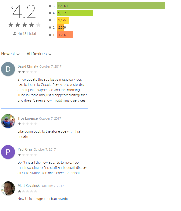
Change in Google Play Store reviews from 10/7/2017 to 10/13/2017:
5 star: +7
4 star: -1
3 star: +16
2 star: +97
1 star: +288
I would be interested in stats from the Apple Store. Judging by the newest reviews, the response is similar.
Screenshot from 10/7/2017
Screenshot from 10/13/2017
Change in Google Play Store reviews from 10/7/2017 to 10/13/2017:
5 star: +7
4 star: -1
3 star: +16
2 star: +97
1 star: +288
I would be interested in stats from the Apple Store. Judging by the newest reviews, the response is similar.
Screenshot from 10/7/2017
Screenshot from 10/13/2017

Terrible upgrade. Made me actually post on the App Store-and I NEVER post on the App Store!!
Userlevel 1
Agreed, terrible! Changing rooms in now a real pain. Roll back please.

I was forced to update this morming to 8.0 while adding a new Play1 for upstairs.
The "My Sonos" page is just a shocking waste of screen space, why have they not either got a list view option or small icon option.
I'm not a moaner normally but this app is very badly designed compared to 7.4.
The "My Sonos" page is just a shocking waste of screen space, why have they not either got a list view option or small icon option.
I'm not a moaner normally but this app is very badly designed compared to 7.4.
Userlevel 1
The WORST and MOST FRUSTRATING UPGADE EVER!
I also concur. Over the last 3 years I have promoted Sonos, to many of my friends and associates, who then also adopted the company's products. The app, prior to the update in September (ish), was so easy to use. The ease of use, combined with the amazing sound from the little speakers, was what sold me.
Now I really struggle to change music in different rooms in the house. I'm in the family room and want to change the music in the living room, but it doesn't want to allow me to have different music in different rooms. I have to fiddle for 5 minutes to get this set, and I'm at the point of so much frustration, I'm considering not purchasing any more Sonos products. I'm already in almost $2K of product purchases.
People want great sound, but don't want to have to *(&^% around with stupidly designed software. I want to relax and listen to good music, not get frustrated by a very poorly thought out and poorly tested software release. I shouldn't have to take tutoring to figure out how to change the music to my speakers.
FIX THIS NOW, PLEASE!
Userlevel 2
I agree this is a huge move backward. If I didn’t have so much money invested in my system, I would move to something else.
Userlevel 1
The upgrade is absolutely awful. I can't find my playlists, can't find genres, can't find anything! Fix it asap.
Userlevel 1
I just signed up to this forum so I could also share my views on this terrible update .... beat me to it.... terrible update. 😠
Userlevel 2
Absolutely agree, I’m now left scratching my head and frustrated not knowing where anything is anymore, it’s a dreadful update. Why on earth add new icons to make things more difficult to navigate! I’m so annoyed with myself for updating all three of my iPads, thank goodness I haven’t updated my phone, so at least this still has the old app on it and I can use it to operate my Sonos. Please Sonos take us back to the old app, it was so much more user friendly.
Userlevel 2
I will second–no, thousandth–the sentiment of this thread. The new app sucks. I'm often listening to music and when I want to switch my speakers to the TV, I have no idea how to. And when I manage to, I have no idea how it even happened like I'm just mashing buttons and making it work through sheer will. Nothing about the app feels right.
As an experience design professional, I loathe to be the person who put this steaming pile together. Test the damn thing before you release it!
As an experience design professional, I loathe to be the person who put this steaming pile together. Test the damn thing before you release it!
Userlevel 2
If you look at the VP of UX's LinkedIn profile, they tout:
"App: with an App store rating of 4.5 stars & over 47,000 reviews, we have set the standard for the best way control your sound system. "
Impressive! Even more impressive is how quickly you just made that bullet point irrelevant. 😛
"App: with an App store rating of 4.5 stars & over 47,000 reviews, we have set the standard for the best way control your sound system. "
Impressive! Even more impressive is how quickly you just made that bullet point irrelevant. 😛
Userlevel 1
I concur with pretty much everyone who has complained about the latest 'upgrade'. It is less intuitive, difficult to find what you want and about as unfriendly as you could make it - in fact it is just plain HORRIBLE.
Come on Sonos, let us roll back to the previous version while you work on a replacement - but whatever you do, DON'T let the guy who designed this one loose on it !
Come on Sonos, let us roll back to the previous version while you work on a replacement - but whatever you do, DON'T let the guy who designed this one loose on it !
Userlevel 1
Come on Sonos, let us roll back to the previous version while you work on a replacement - but whatever you do, DON'T let the guy who designed this one loose on it !
Yes, this is the first time I have actually created a user account for an app so that I could voice my ongoing frustration with the "upgrade." This truly is a downgrade, now matter how much Sonos may want to argue otherwise.
I have invested heavily in the sonos product line over the past three years, without a single regret; music in 6 rooms, playbar, amps abound........but now I am very frustrated.
Another user stated it clearly: a version improvement should NEVER leave existing users in the dark without a smooth transition. That is simply the indication of a poor UI enhancement. And an attitude that says "just learn the new interface" is a poor response to the legions of unhappy users.
Finally, while I understand that many people want the Siri-like experience of using the Amazon puck device, its not for me. I don't want big brother listening/analyzing/cataloging everything my family says. Personal choice. So if this UI change was driven by the Amazon partnership, that is even more dissapointing.
At the very least give those of us who want it a WAY TO ROLL BACK TO THE PREVIOUS VERSION!!!!
LISTEN TO YOUR CUSTOMERS!!
Userlevel 1
I completely agree. I haven't been on the forum in years, but signed in again to lend my voice on this pile of garbage.
Userlevel 2
Userlevel 2
I disagree. The reaction to the app amongst users is testament to to that. It would be nice if they would acknowledge the issues people have and reassure them that they care. A little empathy goes a long way to customer satisfaction and building an app they will like in the first place.
Userlevel 2
 +1
+1
The new app is horrible. It makes my Sonos system harder to use! Up until now I've been content to recommend Sonos to my friends and colleagues but until there's either a roll back or a new version with a user interface more like the old I won't be recommending.
And let's have the (option of a) dark interface back. I often listen to music in low light. I don't want a torch turned on in my face when I want control.
I understand the need for changes as cooperation with Amazon for voice control proceeds but the interface change seems to me to be change for no good reason. Please stop messing with my music interface!!
OMG. The new app is just heinous. Clumsy, non-intuitive, awkward. I used to be able to just hand a tablet with the app to friends when they come over and they could easily start using it, finding music from my library, from services, changing playlist, etc. Now I can't even figure out how to do some basic functions without having to hunt all over the place. It isn't just bad, it is horrible. Sonos, listen to what your users are telling you. The new app is a serious problem.
Like most people-except John B-I actually hate this new app and find it takes way more away then it adds. Mostly that it was an unnecessary change for the sake of change.
I have 18 Sonos and will not buy anymore. My wife refuses to use it anymore and friends that used to come over find its not as intuitive to use.
There are always gonna be Sonos apologists but the truth in numbers speaks volumes. I’m sure Sonos will just try to wait this anger and disapointment out from the people that have helped keep the company successful-but they have taken my loyalty for granted on this one if they don’t listen to the masses
I agree the new app is dreadful. I use Sonos almost exclusively with Tidal and would like to hear more about being able to control Sonos directly from the Tidal app. I understand this functionality is to be introduced this year?
Page 1 / 5
Enter your username or e-mail address. We'll send you an e-mail with instructions to reset your password.