Apple app missing features that Android has

  • 28 February 2021
  • 13 replies
  • 218 views

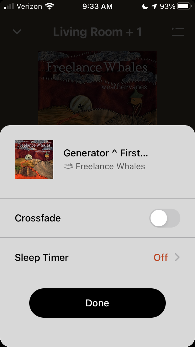
I have an Apple IPhone SE2, which I’ve  updated religiously. Currently running the most up to date versions of iOS and the Sonos app. My husband has an Android phone & recently began using the Sonos system too. 
 

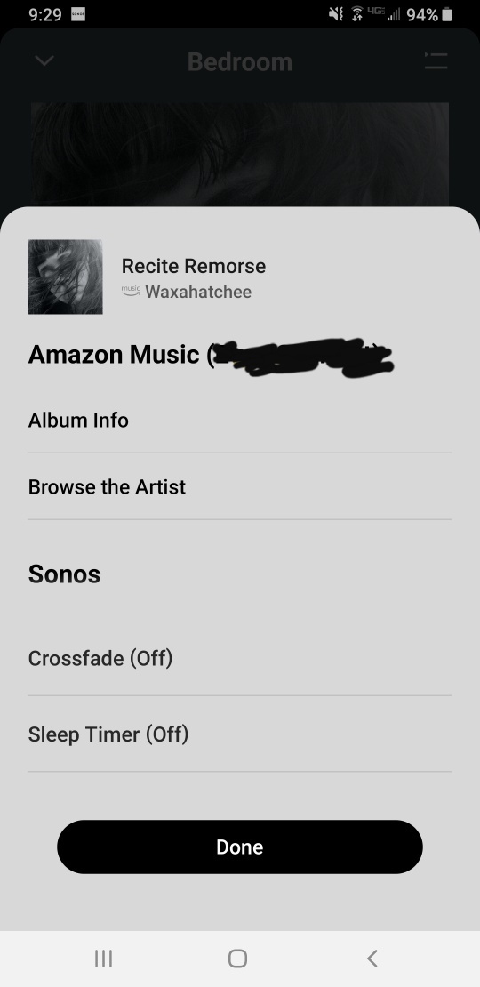
We just noticed that (from within the Sonos app) he can access “Album info” & “Browse the Artist” - in addition to “Crossfade” & “Sleep timer” by clicking 3 dots on the currently playing song screen. HOWEVER, by the same method I can only access “Crossfade” & “Sleep timer.” I’m super bummed and can’t seem to find any way to browse similar artists through the Sonos app - vis a vis my Amazon Music account.
 

It feels like the developers forgot to give the Apple app this option - what gives? Anyone else notice this?


This topic has been closed for further comments. You can use the search bar to find a similar topic, or create a new one by clicking Create Topic at the top of the page.

13 replies

Hi.

"Super bummed"?

All the same options are available on my wife’s iPad as on my Android phone. It would amaze me if the same were not true of the iPhone app. 

Are you sure you don't just need to scroll down for the other options?

I assume that by "Apple app" you mean the Sonos app for iPhone?

Yes I mean the Sonos app on my iPhone SE2. And no, I can’t scroll down to see more. We both witnessed this phenomenon and tried to find the feature on my Sonos app, but couldn’t.  The first pic is from my husbands Android phone & the 2nd pic will be from my iPhone …..


Also, this isn’t song specific - I tried it while the other song was playing too - and nothing.

I don’t know why the options are not visible on your iPhone - perhaps someone with an iPhone will be able to confirm the position.  All I can do is repeat that my wife’s Sonos app for iPad has the same options as Android.  To the best of my knowledge the Sonos apps for iPhone and iPad are identical in all material ways.

I notice from the iPad app that in Settings, App Preferences there is an ‘iOS Settings’ option.  I don’t know if the answer lies there, because I don’t use iOS devices.  You might also try just resetting the app on your iPhone and then choose ‘connect to existing system’.

I think this is much more likely to be a local issue than a generic difference - I have never seen this issue raised before.

Further thought, although I doubt it is relevant…. do you each have your own Amazon Music account or is there just one Amazon Music account on your Sonos system?  

Have you tried using any other music service or locally-stored music to see if this arises only on Amazon Music or more generally?

Thanks. There isn’t anything in the iOS settings for this app that makes any difference. Also, we do use our own Amazon accounts - but within the Sonos app you can choose which account you’re viewing - so we tried it with both & got the same issue. Not all music services have the same functions or features through the Sonos app, so that’s not a good way to compare.

I know that iPads are sometimes different than iPhones (in terms of app functionality and features) - so I’m not going to try to compare that to my iPhone. 


I appreciate your thoughts.

I know that iPads are sometimes different than iPhones (in terms of app functionality and features) - so I’m not going to try to compare that to my iPhone. 


Not for Sonos.

I am now wondering if this is a display issue on the iPhone SE2, which has a relatively small display.  I am in no position to check, but if there is someone out there who could take a look at what options are available on their iPhone and post back, that might shed light one way or the other.

It’s a bug (or conceivably a feature), presumably limited to small-screen iDevices. I see the same behaviour on an iTouch.

It’s a bug (or conceivably a feature), presumably limited to small-screen iDevices. I see the same behaviour on an iTouch.

Thanks for confirming.  The S2 app is certainly more screen-space-hungry than earlier versions.  There have been quite a few posts from Android users complaining that menu items have disappeared, when in fact they now need to scroll to find options that used to be immediately visible.

Ahha!! I found the menu - but I agree that it seems like a horrible bug, meaning I literally had to discover that a single text line is scrollable….But it only has a viewing window of a SINGLE text line. It’s very hard to find, scroll, and see. It should be taller than a single text line. Thanks everyone. 

I can only agree.  The "Crossfade" and "Sleep Timer" options take up excessive space. It feels like a fairly simple redesign could make it much easier to use. 

I imagine larger iPhones are easier to use, as with larger Android phones. 

Actually - it turns out to be a glitch when I use the display zoom view on my phone. If I use standard view the items show in the menu (still a tiny single line)...but when using the display zoom view they aren’t even there - nothing to scroll or even find at all.