
Best answer by Ryan S
View original
Alarms "hidden" in System Settings with 10.4
Ah come on Sonos, alarms used to be so easy. It used to be click ‘More’, click alarms. Now in 10.4 it’s click ‘Settings’, click ‘System’, scroll around a bit, click ‘Alarms’. Why? Sometimes it feels like Sonos is constantly changing stuff for the sake of change, not to improve the functionality.
This topic has been closed for further comments. You can use the search bar to find a similar topic, or create a new one by clicking Create Topic at the top of the page.
Page 1 / 6
I've always (had Sonos for well over a decade) seen Alarms as a function of the system, "wake up to your favourite music/radio" and one of its original selling points.
In terms of frequency of changing alarm setting, I probably change them between 2 and 3 times per week to suit my work pattern, either to adjust the time or to enable/disable.
Straight after 10.4 update, I went to enable my wake up alarm for the next day to find its now further down a sub menu and page.
Completely agree with the OP that moving the Alarm option is not a good thing.
Userlevel 3
Hi Ryan S,
I set my alarm daily because I don't have a regular routine. For me, I think I have once used the add services function from the settings menu and never any of the others - my system is set up and doesn't change or need to change. So I don't understand the need to bury the alarms function (it's a function not a setting for me).
Some suggested solutions:
1. Put the alarms back on the settings page at the top level. Put it at the bottom if you feel it's not used very much. There's empty space on the setting page on my screen so it will work perfectly for me!
2. Presumably more work programmatically, but would make more people more happy: give me the ability to flag to favourites to appear at the top of the settings page. Then if I use alarms a lot it's there for me. Or if I like some other settings I can put those there instead.
Ed
Userlevel 3
I use the Sonos-alarm on a daily basis, but the time varies from day to day. Therefore, before I go to bed I check that the alarm is set and set at the correct time.
For that exact reason, I do not consider the alarm a system setting and as it seems I am not the only one.
Complaining is easy about new functionality, but what could be a potential solution?
From my point of view it would be nice to have the alarm setting directly linked from the "My Sonos" part of the app (bottom left). As we can edit this page anyway, it could be hidden for everyone by default and if you need it, you add it through the edit of the My Sonos (top right).
Userlevel 3
not happy with this "update"
i have used the alarms feature daily ever since i have had my system
Yes, daily.
My job means i have to get up anywhere between 0700 and 0855 depending on where i am going that day
So i set my alarm every night. I have had sonos now for many years and the alarms feature has been great
It's now not.
Can i revert back to the previous controller?
Userlevel 2
I too find that burying the alarms is ridiculously complex. I eventually found where they were, but multiple levels of menus plus having to scroll past very rarely used options makes no sense at all. I can’t imagine what Sonos is thinking.
Userlevel 7
 +23
+23
I find it bizarre that the #1 item on the new Settings item (on iOS) is "Account", and yet Alarms are buried under "System" (and the more players you have, the more painful it is to get to Alarms). How many times do people use Account vs Alarms? I'm hoping app telemetry shows this priority is backwards and will be corrected in 10.5.
Userlevel 2
I use alarms daily, too, and agree that there are way too many clicks required to get to them now. Just adding my voice to the chorus. I hope Sonos will make alarms more accessible in the next update -- which can't come soon enough for this very reason!

Ryan, Appreciate the non-specific non-solution answer. Perhaps I could rephrase the question as I bet there are other people who are going to be shocked by this unecessary burying of one of the few useful features Sonos has left. Explain why, from a UX/UI point of viewm putting something used often so many levels deep makes sense and conversely, why elevating the spam-box, excuse me, I mean inbox, to such a prominent position as My Sonos is something that will benefit the customer? Are you going to tell me/us that people were clamoring to have the Inbox more readily accessible. I mean the only reason I can think of wanting the Inbox to be elevated is for quicker deletion of the spam, I mean new products, you team annoys us with when we are trying to enjoy our music. So your feedback on those exact questions would be helpful. If you'd prefer to just add it to a list nobody will ever look at or take the quick route with a deletion of this post, that's fine too.
Userlevel 3
I came here to make my first post ever to say the same. Alarms are a feature I check/update daily, I’m sure I’m not alone in that.
It should not be in buried at the same level as the options to change the date or turn on parental controls.
It should not be in buried at the same level as the options to change the date or turn on parental controls.

I do have repeating alarms but I go in and turn on/off when my routine changes. Literally every other option on the top menu looks like something I’d access once/rarely (account, services, app preferences) or never (help, privacy, legal).
Well said. Anyone who believes that you set an alarm as often as you change your wifi settings or add a new music service, clearly is very confused. Alarms are a daily or almost daily activity. The other settings they are grouped with are a set-it-and-forget-it kind of thing
Userlevel 2
Sorry, folks. Alarms are not a “set and forget” function. People whose schedules change regularly go there daily or more. Nice that we have figured out where it’s been hidden, but really, it’s not a system function — it’s a primary Sonos function, and should be easier to get to, not harder.
Please can I add another vote for move alarms up a level in the menu and make more prominent.
I do have repeating alarms but I go in and turn on/off when my routine changes. Literally every other option on the top menu looks like something I’d access once/rarely (account, services, app preferences) or never (help, privacy, legal).
ALSO I’m seeing the alarm menu itself being buggy - text was strobing grey/black on iphone 6S ios 12.4.1 and I couldn’t make any selections. Working again after forced close. I am nervous about setting an early morning alarm I can’t turn off!

+1 from me also to restore the Alarms option to the page immediately under Settings. I use my bedside Sonos as an alarm clock and visit the Alarms screen daily to adjust check wake up times due to changing shift patterns. For this reason (and to cater for the lack of snooze button functionality on the players) I have 12 alarms set up for different scenarios which I switch on and off as required.
Unfortunately the redesign also wastes a lot of screen estate. I could previously see all my alarms easily on one screen, and the green colour on the button when an alarm is ON made it plain at a glance which were on and which were off. I now have to scroll to view the alarms due to wasted space and the monochrome version of the buttons doesn't make it plain at a glance which are on and which are off. You've made a screen which was a pleasure to use rather frustrating.
Unfortunately the redesign also wastes a lot of screen estate. I could previously see all my alarms easily on one screen, and the green colour on the button when an alarm is ON made it plain at a glance which were on and which were off. I now have to scroll to view the alarms due to wasted space and the monochrome version of the buttons doesn't make it plain at a glance which are on and which are off. You've made a screen which was a pleasure to use rather frustrating.
Userlevel 7
+26
The team has concluded their testing and the alarms shortcut is being sent out to all Sonos households today. You will be able to access your alarms screen from the Rooms tab, by clicking on the alarm bell at the top left of the screen. If you don’t see the shortcut yet, check for updates in your Sonos system, as there is one that released today, and then you might just have to wait a little while. The setting is rolling out to homes today and might not have reached your system yet.
Thanks for your patience everyone, and I hope this shortcut makes it easier on your evenings. I’ve also passed on the other feedback for other functionality and displays.
Userlevel 2
I also adjust and add or remove alarms daily. I do not like the alarm position/page change or the UI/UX changes this update has made.
Userlevel 2
Totally disagree with your statement, Ryan! I change them daily and like to have them back on where they were before so I don't have to do so many clicks. Putting them at the same level like Accounts or Audio compression does not make sense to me. Alarms needs to be 1 level higher, at least.
Userlevel 2
Same here; alarms are set daily by all members of my familiy. Has this change even been beta tested? Please move ‘alarms’ up in the menu directly under ‘settings’.
Userlevel 2
What an incredibly stupid change.
revert this change immediately
revert this change immediately
This is a really bad change to the user interface of Sonos. Alarms aren't a system setting. They are used really often, especially to the people with often changing schedules like me. Also the alarms interface (when you get there in the end) is worse then before. Only 2 alarms are directly visible, in earlier versions of the app you got 5 alarms in one view which gave a lot better overview.
Sonos please put the alarms up a level!
Sonos please put the alarms up a level!
Userlevel 7
+26
Hi @brymills , I'll make sure to let the team know you were looking for it.
just to add to my previous post about usability of the redesigned screen:
In the previous app version I could see up to 10 alarms on screen at the same time. In the new I can only see 2 and a bit, so no way to see at a glance which are on and off without scrolling.
It used to be quick to visually scan down the list of Alarms to see which times/days of the week were set, but the addition of extra text appended to the end of the days telling you what sound each alarm will play (whilst a good idea) actually slows down this process as the brain (at least my brain when I'm just about to go to sleep at night) has to process the extra information.
The new monochrome buttons are smaller than the old, seem to be a bit more 'sticky' to use and more difficult to 'hit' without accidentally going into the associated alarm amendment screen. I do prefer the old larger style of button much easier to use with accuracy and found the green coloured background when 'On' much easier to pick out quickly (and more visually attractive to look at).
Please please please move the Alarms screen back up a level under 'Settings' - Alarms aren't a System option, and take another look at the GUI design and layout. I've now decided that I really don't like this new design. It's annoying and frustrating. (Sorry).
Good for you, but it doesn't remove the fact that the update to the UI has made this option more cumbersome to get too. The whole idea or a UI is to make it as simple as possible and within the least amount of steps to achieve a specific function. Adding steps is a backwards move,
Userlevel 1
Have always liked (do like, very much) my Sonos, but the one thing that really ****** me off is illogical UI change like this. In a previous UI change (happily now reverted after - let say - "quite clear" user feedback) the background turned white rather than black - illuminating my whole room while listening to music to relax in the evening lights dimmed, quiet music and a 5" rectangular phone illuminating the whole place!
Now "data" (bad data analysis at least...) has made the UI/UX guys decide that an alarm is a system setting at the same level as audio compression or date/time. Really? Less regularly used than setting up music services or account??? I call BS. I am certain that the data can say this - i suspect a majority never use alarms - but for a minority of your users we use it several times a week. You need to read user data based on more than just frequency (otherwise Sonos will just end up with a "play Sean Mendes" button at the top to suit the populist masses...)
Put alarms back in the level above... as another poster pointed out, there is even a gap on my (not big) screen at the bottom of the menu it should be in!
Throw Services down a level if you need to - I have 2 or 3 and last looked at that when I changed an email address or something ..
Alarms? Every. Single. Day.
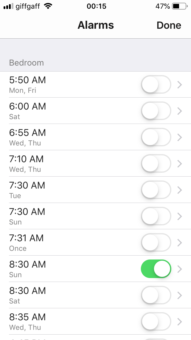
Just to demonstrate the difference between the design of the old and new screens, I’ve attached before/after FULL SCREEN images from my phone.
BEFORE: (clean lines, attractive to look at, great use of available screen space, 10 alarms visible on one screen, nice large on/off buttons to aid selection, green button ‘on’ colour provides a nice and attractive visual aid to show at a glance which are switched off/on).
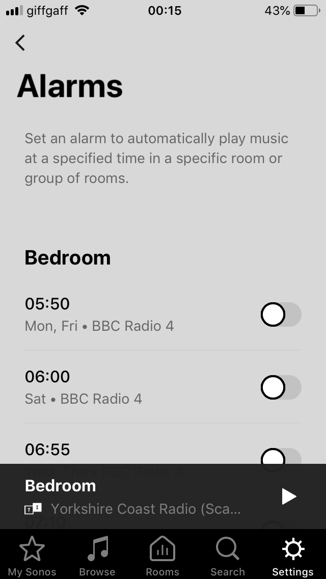
AFTER: (I’ll leave you to judge for yourself but I dislike this new version of the same screen intensely, and my dislike is increasing each time that I use it).
What I’ve also noticed is that (on my admittedly older iPad) the redesigned ‘Settings’ screens have become much more sluggish than the old. e.g. When I select ‘Alarms’ from the previous screen it takes almost 2 seconds before the Alarms screen actually appears. And just as long (if not longer) between selecting an alarm to actually see the Alarm details. I’m sometimes pressing the screen twice thinking that my first press hasn’t been registered. This is ok for accessing Settings which don’t change very often, but I access and use Alarms every day. The new screens certainly seem to be more resource hungry for some reason.
I’m very sorry Sonos designers/coders. I know that you must have put a lot of time and effort into the new ‘Settings’ redesign, but I’m afraid that I just see it as a big backwards step. From my perspective I can’t see what gains it brings, it looks ugly, performs sluggishly (at least on my older iPad) and gives me, as an end user, a poor and frustrating user experience. Please think again.
BEFORE: (clean lines, attractive to look at, great use of available screen space, 10 alarms visible on one screen, nice large on/off buttons to aid selection, green button ‘on’ colour provides a nice and attractive visual aid to show at a glance which are switched off/on).
AFTER: (I’ll leave you to judge for yourself but I dislike this new version of the same screen intensely, and my dislike is increasing each time that I use it).
What I’ve also noticed is that (on my admittedly older iPad) the redesigned ‘Settings’ screens have become much more sluggish than the old. e.g. When I select ‘Alarms’ from the previous screen it takes almost 2 seconds before the Alarms screen actually appears. And just as long (if not longer) between selecting an alarm to actually see the Alarm details. I’m sometimes pressing the screen twice thinking that my first press hasn’t been registered. This is ok for accessing Settings which don’t change very often, but I access and use Alarms every day. The new screens certainly seem to be more resource hungry for some reason.
I’m very sorry Sonos designers/coders. I know that you must have put a lot of time and effort into the new ‘Settings’ redesign, but I’m afraid that I just see it as a big backwards step. From my perspective I can’t see what gains it brings, it looks ugly, performs sluggishly (at least on my older iPad) and gives me, as an end user, a poor and frustrating user experience. Please think again.
Userlevel 7
+26
Thanks for all the feedback everyone! I'll make sure to share it with the team for the future. I don't have any news to share at the moment on if there will be a change here, but if I hear anything, I'll let you know.
Moderation note: I just renamed this thread so people new to the discussion can find it so we don't wind up with a bunch of scattered threads all over.
Moderation note: I just renamed this thread so people new to the discussion can find it so we don't wind up with a bunch of scattered threads all over.
Page 1 / 6
Enter your username or e-mail address. We'll send you an e-mail with instructions to reset your password.